Token File Name - A New Way to Rename Files

Wow, I’m way too far down the rabbit hole when it comes to renaming files on MacOS!

Some background on why I started going down this path is because my friend has a service that repairs/repaints streets and the cities that contract him all have various ways they tell him what streets need to be worked on. These methods almost always include giving him a spreadsheet for every street corner. The file names are usually street names but their convention is really inconsistent so it takes my friend a while to determine where to move his crew next in an efficient way.

How is Token File Name different from other apps?

I previously made Peazy Renamer, which is great for standardizing a batch of files so they have some consistent casing, spacing and less redundant text, but this really only does half the job. The other half consists of fixing the file names so they make more sense.

The most common things my friend would need to do are:

  • re-arrange some of the words in the file name

  • he’d want to prefix a group of files with what type of service they needed

  • some words were misspelled so he’d want to fix them up

The above doesn’t work well for Peazy Renamer, since it was created for batch processing, not for individual file manipulation.

Of course doing all of the above using MacOS’ simple renaming system is actually not too bad, but when you start doing this on a hundred files, it becomes a bit more daunting.

Token File Name was born!

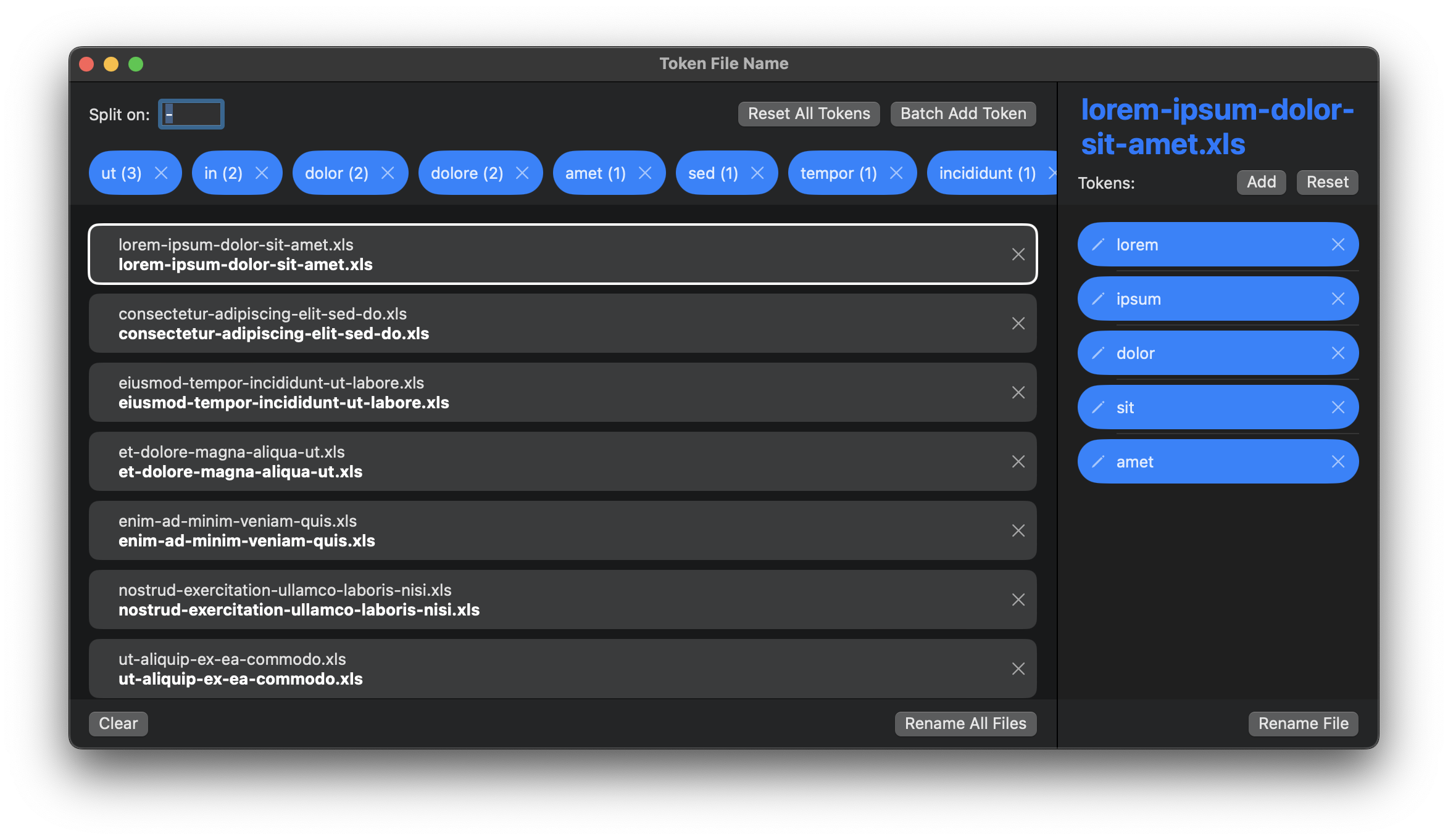
Drag files in and start adjusting word tokens

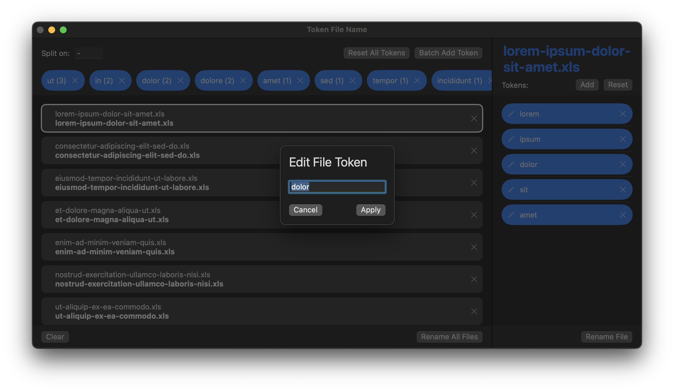
I came up with a unique way to make quick edits to a file name using its word tokens. Once a file is broken down into tokens, you can re-order, edit or delete them. New tokens can be added to the beginning or end as well.

I found that this works really well for small adjustments, but falls a bit flat when someone wants to do large scale changes to a file name so this is definitely not an app for everyone.

The app is pretty straightforward. Drag in your files and on the left pane you can manipulate the whole batch or on the right pane you can make edits to a specific file.

Token File Name was pretty easy to develop. It uses a lot of the same tech I developed for Peazy Renamer. The primary new tech I added was the drag and drop reordering to the Token pane on the right side.

You can find out more about future plans and download the app from the Token File Name FAQ.

Coming Soon: Week Stock

Be warned, this app is more of a fun, experimental tech demo rather than a serious app meant to make actual stock decisions.

I’ve been dabbling in the stock market a bit lately and been having some good luck playing the SPY rallies for quick swing trades. I think this is a fairly well known strategy. It’s not like I stumbled into anything special, but the TLDR is:

  1. Wait for the SPY to drop for 2-3 days in a row

  2. Buy a few beaten up stocks near the end of the day

  3. Pray that SPY rallies the next morning, lifting the market

  4. Sell

I know playing oversold stocks during market rallies is pretty common, and there are dozens of indicators like RSI and MACD that work well with this strategy but, admittedly, I’m a bit of a newb there.

The only data points I’ve been caring about are:

  • The percent change at market close for a stock over the last X days

  • The percent change at market close for SPY over the last X days

  • I’d love to be able to aggregate these to get total % change over X span of days for both SPY and my stock

Surprisingly, these stats are actually hard to come by in most of the apps I’ve tried. I know you can glean this info from charts but those sort of blend the timeline together, I would love a hard break on market close.

This was a fun opportunity to make a quick app myself. It also gives me a chance to fiddle with some really crazy designs for a stock market app! For example, I wanted to design a stock app with no charts and no stock prices! The sheer insanity!

The Watchlist

For starters, getting real-time stock market data is ridiculously expensive but since I really only care about market close prices I can settle for a 15 minute delay in live stock prices. This delay actually makes things easier to implement. Instead of automatic timed refreshing on my watch list, I’ll just give the user a refresh button and they can refresh on demand.

As for the watch list, I wanted a way to show the user which stocks are more beat down than others. I opted to show watched stocks as bubbles… the more negative the stock has been recently, the bigger the bubble. I know, there are waaaaaaay more efficient and straight forward ways to show this than my falling bubble design (like a traditional heatmap) but what fun would that be? I also get to learn about integrating SpriteKit gaming physics (ie, dragging bubbles around the screen) into a SwiftUI app.

The biggest downside to this design is that, depending on the size of your phone, it really only works with smaller watch lists. Anything more than, like, a dozen stocks and the bubbles start pushing off screen. I personally have very small watchlists so this doesn’t really affect me much but I can imagine this being a deal breaker for others.

I’ll reveal the algorithm behind the bubble sizing in the app’s FAQ once it’s officially released.

The final part of the Home Screen is at the top, where it shows you current SPY data and a red/yellow/green stoplight to indicate market status. Yellow would be pre-market/after-hours, red is closed and green is obviously open. Unfortunately, I don’t have access to non-open market trades but this should be ok for now.

The Stock Details

Next up, when you drill down on a stock, what details do I want to show? Well, as I mentioned several times, I want to see the closing percent change of the stock for each of the last several market days and I want to see that in relation to SPY’s closing percent.

I also want to:

  • be able to pick a day in the past and aggregate the percent change for the stock and SPY since that day

  • see a few data points that help me determine if a stock is oversold, like, 52 week range, current price in relation to 50 day and 100 day moving averages

  • see a non-interactive mini-chart for today’s market, just so i can see what direction things are currently trending

That’s it, nothing more, nothing less. The idea is that I use my app to look for buy signals then I pop open Robinhood or something to finalize the deal.

That’s why the app’s name is Week Stock (sort of a play on “Weak Sauce”), because I really only care about the what’s going on over the last week and… I guess… I’m looking for “weak” stocks, haha. I kill me. Anyways, naming things is not a talent of mine.

Dropped Features

One item I added to my app but ended up removing is the ability to see Top Losers for the day. While it made sense in theory… after all, I am trying to find something beaten up on a down SPY day to play into a SPY rally… it wasn’t very good in practice.

My app is meant to be really barebones… it doesn’t even show you the name of the stock (it assumes once you added it to your watchlist, you kinda know what you’re watching). With the Top Losers, many of these stocks I was unfamiliar with and I didn’t feel comfortable even following these without looking at the company name, description, debt, volume, latest news, etc.

To make Top Losers viable it meant converting my app to more of a full featured app and losing a bit of its quirkiness. Also, many other apps out there support Top Losers already so this feature wasn’t bringing anything new to the table.

Conclusion

The API I’m using is Polygon.io. I evaluated quite a few market APIs and this one had some of the best documentation, a really good range of API endpoints and was pretty affordable.

In the end, I’m having a blast working on this app and, as usual, my entire app library are just apps I make for myself and throw them on the App Store for free. Who knows, maybe someone else will find this useful.

I’m hoping to have v1 of this on the App Store in a 2-3 weeks.

Peazy File Renamer - Let's Clean Up Your File Names

Yeah, yeah, I know… not another quick weekend app, lol. I’m sorry but these are so fun!

I just need to do a few very simple things on the Mac and, although I know there’s some great scripting tools that can do this stuff in a snap, I just find it enjoyable to make the UX around a Mac App.

Now that SwiftUI works so well on MacOS, it’s a no brainer. In the past, MacOS development was quite a bit different than iOS so it was tedious to do this kind of stuff.

How is Peazy Renamer different from other apps?

As part of a side hobby of mine, I aggregate client files and they’re always named something ridiculous like John smith’s — NOTE: About_someThing.10-23.txt. When dealing with these, I always wanted to standardize these file names to something closer to: john-smiths-note-about-something-10-23.txt.

There are actually quite a few Batch File Renaming apps on the Mac App Store. I tried a bunch (even bought some!) and kept running into a few annoyances:

  • I really needed a way to deal with all non-alphanumeric chars in sequence but every app I tried needed me to enter replacement rules for each non-alpha char one by one

  • The above wouldn’t be too bad if I only had to do it once, but all of the apps I tried didn’t save your rules so you need to re-enter them every time you run the app, this is a huge pain for me since my rules for every batch of files more or less stays the same

  • I couldn’t drag and drop individual files to a list, I needed to always select whole folders then remove files that I didn’t want to rename. Also, adding more files (from other locations) to an existing file list didn’t seem to be supported in many of the apps I tried

  • The file names I was dealing with are pretty long and many of the apps showed before / after names side by side (left / right) where a lot of the file names would be cut off

  • Some of the apps I bought had, like, 20-30 different rule types that can be applied to file names. I only needed, like, 2 (replace/case) so this was quite a bit of clutter. Honestly, I dug into many of these rules and I can’t even imagine a scenario where most of these would be useful…

Peazy Renamer was born!

Drag files in and set up some file name cleanup rules

When I developed LQC, I created some useful helpers for dragging and dropping files, extracting file names and extensions, etc so getting the foundation of this app working was pretty straightforward.

Applying the rules was also pretty easy, the only hiccup I ran into was Apple has this Sandbox architecture for Mac App Store apps that prevents you from renaming files that you individually dragged into the app. Dragging the file into the app gives you access to the file, sure, but renaming a file is actually “moving” it to the same folder with a different name. Since you’re never granted access to the enclosing folder, renaming these kinds of files is impossible for a Sandbox app. Now I understand why all of the apps on the App Store require you to drag a folder… not the files.

Ultimately, I elected to just notarize the app for download from my website instead of the App Store so that I can keep the file selection feature. Also, as I said before, there are a ton of file renaming apps on the App Store so I doubt anyone would even see mine.

You can find out more about future plans and download the app from the Peazy Renamer FAQ.

LQC is Here!

Be pre-warned, this is not a great app…

LQC serves a very specific niche use case, which is mainly compressing the file sizes of videos made from iPhones.

Does it work with any other file formats other than mp4? Almost never.

So why did I make this app?

When you’re a new dad, you find yourself taking videos of everything your kid does and wow… iPhone videos are quite large and very high quality! My family video storage is a pretty crazy size at this point (she’s 6 now) so I was thinking of a way to compress the all videos that I have that aren’t marked as favorites. I still want to keep them around for nice memories but don’t really need them to be the highest resolution possible and taking 300MB+ each.

File size savings on most videos is usually above 80%

How is LQC different from other apps?

I bought and tried a few other MacOS video compression apps and it seems like they suffered from these issues:

  • Needed me to input number of different settings, like, bitrate, fps, resolution, etc. The problem is I actually don’t know what the best settings are here and setting these often seemed to make no difference at all or very wildly between 2 different apps. This required a lot of trial and error to try and figure out what I want. Also when batch compressing, you often have to set some of these settings manually on every single video in the list…

  • There are many bells and whistle I didn’t care much about, like previewing thumbnails, trimming content, upload directly to social media and stuff. Let’s just compress the videos nicely and call it day.

  • These apps seemed very slow. I feel like it’s because these were all mostly created years ago using old 3rd party frameworks. These apps were built to work generally across all file formats, kind of a “jack of all trades, master of none” theory. I was looking for something that worked very well on iPhone videos specifically.

LQC was born!

Little Queen Charlotte (LQC) from Epic Seven mobile game

My idea was to use the latest iteration of Apple’s own AVFoundation framework to create an iPhone video compression app. This is the software Apple themselves uses to manipulate video files, so I figured this has to work well on videos created from Apple devices, right?

Due to using the latest Apple frameworks, this app is only available on MacOS Sonoma. I’ll very likely update the app with the latest frameworks every year to see if there are any additional gains to be had, so requiring the latest MacOS version will be commonplace.

So how are the results?

Not too bad... I feel like LQC does better than the other software I tried at:

  • Faster at converting the video to low res

  • Quality of the shrunken low res video is better given the same settings that LQC uses

  • Resulting low res video is often 80% smaller than the original, which beats the gains I saw in other apps

This hit all of the marks I was aiming at, so I was happy with the results. I only have 2 main issues with LQC:

  • Some mp4 videos that I’ve downloaded from the internet are poorly generated or reformatted, resulting in LQC low res videos having around 10% of the video at the end being dead air, instead of the actual content. I haven’t run into this on videos pulled directly from device. Just be wary of this and preview the compressed video before you decide to delete the original.

  • Honestly, not supporting other file formats is a bit of a downer because the benefits I’ve seen from LQC is pretty nice. I still need to use other compression apps to handle, like, wmv files my parents send me from a birthday or something.

Really only works well for MP4 videos generated from iPhone

How does LQC manipulate the video?

LQC settings are hardcoded for now. If people request these to be editable in the future, maybe I can make some changes but for now the app behaves like this:

  • Bitrate is dropped to 1MB

  • FPS is dropped to 25

  • Resolution is dropped to where the smallest side, for example, portrait (width) or landscape (height), will be set to 480 and the long side will be adjusted appropriately to maintain original aspect ratio

You can view the reason why a file is ‘Skipped” by looking at the details

With these settings an 800MB video was dropped to around 120MB and still looked ok, especially when viewed from a phone.

You can find out more about future plans and known issues in the LQC FAQ.


EDIT: I removed this app from the Mac App Store. It seemed so niche that it wasn’t worth the effort to submit for review on every update, also, I imagine it will get a ton of bad reviews because it only works on MP4 so for now the app is available for download in the FAQ section linked above.

Daily Fast: Finally... A Home Widget!

Daily Fast update 2.6 now comes with a Home Widget.

I have to say, this was probably the most requested item over the last little while. I never put too much thought into it because I don’t use Home Widgets very often myself but once I got around to building this, honestly, this is clearly the best version of the app. I even remove the app itself from my home view and simply use the widget to interact with the app now.

The only downside is that these cannot be animated outside of Apple’s out of box layouts so there’s no way for me to have the blue fill slowly decrease over time like it does in the app. That’s ok, the timer is what matters.

New Color for “Fasting” Windows

To help with the widget design, I also added a new orange “Fasting” window color since the old one was the same color as Day Off (gray). I can see how that could be confusing at first glance.

Here’s what they look like now:

Fast Until Tomorrow…

To address a weird scenario, I added a new “Window” type to the app:

So “Fast until tomorrow” is a window that falls in this range:

  1. You completed today’s eating window

  2. You have a day off tomorrow

If you didn’t have a day off tomorrow, I would just have a timer until your next eating window. However, this gets kind of wonky when you have a day off tomorrow… then the timer will be until the “next” eating window… But what if you have several days off scheduled? Here is where the app ends up with a ridiculous timer, like, 112 hours or something.

Originally I tried to fix this by setting their “Fasting” timer to midnight but that was kind of wonky as well… should I alert the user that they can start eating at midnight?

What the user really wants is to not eat until they wake up the next morning. I have no idea what the user’s waking schedule is so I just used the existing 112 hour timer under the hood but modified the messaging during this window to be “Fast until tomorrow”. At midnight, the messaging changes to “Day off” but no alert is sent out. This seemed to be a good compromise in the end.

Hopefully people find this extra messaging a bit more useful than the crazy timers the app was showing before.

Diving Back Into Daily Fast

I’ve been reinvigorated to finally do some updates to Daily Fast after, like, 2 years. This is mainly thanks to the great reviews and emails I’ve been receiving. If you’re reading this, thanks for taking the time

Now, my recent update was basically just re-building the app for iOS 16 and cleaning up the code a bit, but the one major change was in the Summary View. In the old app, this was meant to be a screen where you can see your fasting history and track how you’re doing.

There are some problems with this Summary View:

  • You can only see the last week, nothing before that

  • You can’t make any changes to your fasting history, like, if you forget to adjust your fast one day

  • WTF do those bars at the bottom mean? I mean, seriously. Is the blue bar your eating windows or your fasting windows? I assume it’s your fasting windows because at the top “Fasted Days” is colored blue but honestly I am not sure, I’d have to look at the code to find out. I can imagine how confusing this would be to a user.

So, I created a new Summary View that’s based on a calendar, allowing you to view your Eating Window history for as far back as you want. This system also allows you to edit and adjust any of your past Eating Windows.

Why “Eating Windows” instead of “Fasts”? I started with adding Fasts to the calendar but this actually gets really tricky because almost every Fast spans multiple days, even if you just eating today from 3pm to 7pm, the time outside of this counts as a fast, so your fasting period would start yesterday after your last meal, then start again at 7pm today and go until you wake up the next day?? So having a single eating window on one day almost counts as 3 days of fasting information… How to show this on the calendar was a huge pain, especially if I look to the future where I want to fully support extended fasts.

In this case, Eating Windows just makes a lot of sense.

Roadmap

So what’s next? I’m pretty motivated right now, I just hope I find free time to continue working on the app. Here’s what’s on my To Do list based on requests from users:

Ability to adjust the duration of your current eating window

Right now you can change your current eating window start time with a couple of button taps but what if you want to change the length of your eating window? You can’t! I’ll probably add this in the next update.

Ability to change app or app icon colors

This one was a recent request and it makes sense. In my latest update I actually removed Light/Dark mode support and just forced Dark Mode, because I wanted to primarily focus on making it look great in Dark mode. Now that this is in place, I only really use 2 colors in the app, maybe 3 if you count the gray fasting progress. Allowing users to customize this would go a long way, especially for people who may be color blind. Changing the App Icon would be the same deal, it allows people who really care about color coding their home screens to fiddle with this.

Support for iOS widgets outside of the app

This one is a big request. People always ask for an apple watch complication or a home page widget for their iPhone that just has a timer on it. In iOS 16 they introduced new Lock Screen complications that look really useful. It’s time to expand the app!

Support for extended fasting (over 24 hours)

Daily Fast is more or less hardcoded to only support Intermittent Fasting where you have a set eating window each day. If you want to skip your eating window or fast for several days, you’ll need to track that in a separate app. I’ve actually drawn up many designs for this and this is not as straight forward as you think it is. I feel like I’m close to cracking this nut but will likely be the last thing I do.

Anyways, as usual, if anyone has any feature/improvement recommendations I’d love to add them to my list. Please send me a message in the Support area of my site.

Gift Hound Finally Updated for the Holidays!

Well, I finally decided to update Gifthound after, like, 2 or 3 years. Why? Well, I actually decided to download and use it to track gifts for the family this holiday season and WOW… either my eyes have gotten really old (likely true) or the colors I picked in my app design were terrible (likely also true).

Here’s an example:

I usually have an iPhone mini but I recently upgraded to the iPhone 14 Pro and this larger screen really makes everything on the screen seem tiny.

The actual functionality of the app is really good, I would say probably one of the best gift tracking apps on the app store, but everything was just really hard to read. White text over light yellow colors?! Light gray text over light blue backgrounds?! What was I thinking? This was an issue on a lot of the views.


The revamp increased the weight of the important text, added high contrast colors and increased the size of all the icons. This makes things much easier on the eyes.

Also, with the old app, “tappable” items were white… but a lot of non-tappable items were also white, so this didn’t make it very clear as to what was tappable and what wasn’t. A common complaint I had was someone not knowing how to set a custom event, like, a birthday or anniversary (tap the text under the holiday name at the top). I feel like the new app is a bit more intuitive.


The above is a few other examples of the improvements in readability.


The insert/edit gift interface is cleaner and easier to use now. The tap targets here used to be so small.


Lastly, 2 more things bothered me about the old app.

One was this weird “Settings” button that only appeared in the recipient list. So when you’re naturally toggling between gifts and recipients, this ugly button would disappear and reappear.

The purpose of this button is to change what gift status is considered “Done” for recipients. This was needed because, personally, I consider the gift “Done” for a recipient when it’s “Received”. Someone else may not consider it done unless it’s purchased or wrapped?

Anyways, based on the above, it’s obvious this button would only every be used once or twice for the lifetime of the app. The user would set what Done status they want and never change it again. So having this slapped on the main page was silly. I made the decision to move it to the App Settings instead.

To be honest, this App Settings plist was a huge pain and I feel like this hasn’t been updated since, like, iOS 3 or something? Horrible… but it got the job done.


The second thing that bothered me was how you can tap on the icons on the gift list to pop out menus to either go to the recipient details or to change the status of a gift.

The problem is, it would just pop out a menu with only icons in it and it was difficult to discern what they represented.

I updated the menu to use Apple’s new UIButton.menu (UIMenu) system and it worked great, saved me tons of code and extra view controllers.

In conclusion, I don’t think many people were using the app to begin with, likely because of how hard it was to read. When I searched for “Gift Tracking” on the App Store, my app was wayyyyy at the bottom of the list. I’m hoping with these updates, maybe a few more people will give it a try and it will climb up the search rankings a bit.

Epic 7 Substat Roll Range

These are the gear roll ranges used by the E7 Gear Scanner iOS App.

All information was gathered from this E7 stove post.

Please note that rolls in the outside ranges that have a significantly low probability compared to the other roll targets (for example, a half of one percent chance to get a 5 speed roll) have been removed so that they don’t impact the roll success algorithm.

Heroic Level 72 - 85

  • Attack: 32 - 43

  • Attack %: 4 - 8

  • Defense: 26 - 32

  • Defense %: 4 - 8

  • Health: 150 - 191

  • Health %: 4 - 8

  • Speed: 2 - 4

  • Effectiveness: 4 - 8

  • Effect Resistance: 4 - 8

  • Critical Hit Chance: 3 - 5

  • Critical Hit Damage: 4 - 7

Epic Level 72 - 85

  • Attack: 33 - 46

  • Attack %: 4 - 8

  • Defense: 28 - 34

  • Defense %: 4 - 8

  • Health: 158 - 201

  • Health %: 4 - 8

  • Speed: 2 - 4

  • Effectiveness: 4 - 8

  • Effect Resistance: 4 - 8

  • Critical Hit Chance: 3 - 5

  • Critical Hit Damage: 4 - 7

Heroic Level 88+

  • Attack: 36 - 50

  • Attack %: 5 - 9

  • Defense: 30 - 37

  • Defense %: 5 - 9

  • Health: 170 - 217

  • Health %: 5 - 9

  • Speed: 2 - 4

  • Effectiveness: 5 - 9

  • Effect Resistance: 5 - 9

  • Critical Hit Chance: 3 - 6

  • Critical Hit Damage: 4 - 8

Epic Level 88+

  • Attack: 38 - 52

  • Attack %: 5 - 9

  • Defense: 32 - 39

  • Defense %: 5 - 9

  • Health: 178 - 229

  • Health %: 5 - 9

  • Speed: 3 - 4

  • Effectiveness: 5 - 9

  • Effect Resistance: 5 - 9

  • Critical Hit Chance: 3 - 6

  • Critical Hit Damage: 4 - 8

Epic 7 Gear Scan FAQ

Hopefully, Epic Seven will eventually add some sort of “Gear Score” or “% Success Rolls” type of stat on their gear and this app wont be useful anymore.

What is the purpose of this app?

WARNING: This app is meant for scanning gear that meets all of the following:

  • Level 72 and higher

  • Upgraded to +15

  • Heroic or Epic grade

The algorithms and interface are not optimized for scanning gear that doesn’t meet the above criteria.

I made this app to quickly scan my +15 gear and find gear that I shouldn’t be keeping or that is ideal for reforging.

Currently, to do this I need to manually enter substats into a website one by one for each piece of gear, which is a bit tedious.

If you have a lot of gear and use E7 in an emulator then Fribbels gears optimizer is the recommended way to quickly assess your gear quality.

How accurate is the scanning?

I would say the app scans all of the information accurately about 95% of the time.

How do I calculate score?

I previously used this algorithm from artistalley7.com. It worked pretty well but there was a couple things I disliked about it:

  1. It undervalued flat stats significantly (max flat stat rolls were around 4%)

  2. It resulted in 2 different gear scores, one for 88+ gear and one for 72-85 gear

In the end, the app no longer calculates “gearscore”. Instead the app simply tells you how successful your average substat rolls are.

The app uses min and max roll range defined here for each gear grade and level along with total possible rolls to determine how well your gear substats rolled.

A score of 82 in the app, for example, means that the gear rolled 82% of the possible max substats.

Here’s an example:

Level 85 Epic Gear (4 base rolls + 5 upgrade rolls = 9 total rolls)

  • Health - 20%

  • Attack - 15%

  • Speed - 4

  • Critical Hit Chance - 10%

Health % - 20 -> 3 Rolls (24 max) -> 67% success average

So looking at substats it’s important to understand something. For Health %, you can roll a max of 8. So if you roll a 4 does that mean it was a 50% successful roll? No, the minimum roll you can achieve is 4, so this would actually be a 0% success roll.

Looking at the above substat, a roll of 20 is an estimated 3 rolls. The max you could have gotten is 24 but if you subtract the minimum rolls that are simply handed out for free (12), you gained a total of 8 out of a possible 12. So your average roll success rate in health would be 67%.

Attack % - 15 -> 2 Rolls (16 max) -> 88% success average

Speed - 4 -> 1 Roll (4 max) -> 100% success average

Critical Hit Chance - 10 -> 2 Rolls (10 max) -> 100% success average

The thing about Crit Chance is that the min-max is 3 - 5 with equal probability, so the above is equivalent to 2 rolls of 5 with 100% success.

Now, an Epic piece of gear gets 9 rolls total but adding up the rolls on the substats above is only 8. So this piece of gear had some rolls so low that, in aggregate, they’re equivalent to missing a whole roll. The problem is, missing a whole roll can’t just be considered an additional 0% success roll added to the formula because you didn’t even get credit for the min roll amount.

So this is where I subtract a 100% roll from the score before generating the average. Obviously, this is a bit harsh but in my opinion, missing a whole roll is usually a reason to not keep a piece of gear. I did try some other variations, like, adding an additional roll threshold to one of the substats but the results were really crazy depending on which subtat happened to be there.

The final result is a 71.875% Roll Score on the above piece of gear. For reference, if I treated the missed roll simply as a 0% roll, then the success score would have been 75%.

Remaining issues….

A few of items of concern are with:

  1. Substats with really small ranges, like, Epic 88 speed has a range of 3 to 4. So at 3, it’s a 0% roll but at 4 it’s 100% roll. This is a pretty wild gap and the scoring shouldn’t be this dramatic over the loss of just 1 speed.

  2. Modified gear has a lower range than what rolls are. For example, Crit Chance on an 88+ Epic piece of gear has a 3-6 roll range, but if you modify this stat with gems it has a 2-4 range. I’m treating this like a normal roll, which of course can result in a negative roll % for this subtat.

  3. I’m calculating reforged gear using Epic7’s defined 88+ increases, which is not always correct. Some reforged stats aren’t handled this way and it could cause some issues.

I will likely need to make some formula adjustments for these scenarios but for now these haven’t been addressed.

I think I might have scanned the same gear a bunch of times, any issue with this?

Gear with identical information will be ignored by the save system.

What is the difference between Scan Gear and Auto-Save Scanner?

Scan Gear is meant for scanning a single piece of gear and determining it’s Roll Score.

Auto-Save Scanner is meant to scan dozens of pieces of gear quickly, one after another, automatically saving them to your inventory so that you can sort/filter and evaluate them in later.

Auto-Save Scanning Example

What’s a good roll score?

Take into consideration, you should NOT be just blindly throwing away gear that has a low roll score.

If a piece of gear is missing a roll but all other rolls went into the same substat, even if they had average success, I would likely keep that piece. Stacked substat pieces like this are extremely valuable.

Same with rings and necklaces. Mediocre substat rolls that synergize with a good main stat is way more valuable than high substat rolls that don’t synergize.

Equipment sets function the same way. Getting crazy good rolls on support substats for a Crit or Destruction set makes the piece very "meh”. For example, a Destruction set with high effectiveness? Just think to yourself, “Who would even equip this?”.

The above types of gear probably shouldn’t be rolled on to begin with or ditched as soon as the wrong substat gets a couple of rolls.

When the above is factored in and you start to look at low Roll Score gear you should be tossing in the garbage but the “min” threshold is different for a lot of players. A new player may want to keep gear above a 50% roll score. A veteran player will likely toss anything lower than 65%. A whale will likely have a 75% threshold.

How do I personally use the app?

Originally, it’s tedious but I want to scan in all of my +15 gear. Then I’ll sort by roll score and using the evaluation above I’ll trash the bottom 10% of my gear. I’ll reforge the top 5% of my lvl 85 gear.

After that, every 2-3 months, scan in my newly acquired lvl 85 +15 gear. I’ll then analyze and remove the bottom 5% of my gear and I’ll reforge the top 5% of my gear.

Over time, my gear should improve more and more.

Care Paper 2.1

Care Paper 2.1 to 1.0 Comparison

For support issues, please send a message via the form here.

Care Paper is an app I developed because I wanted to keep track of my family’s medical history. Things like remembering old prescriptions or when my last eye doctor or dentist appointment was and what treatment happened back then always eluded me and also my family. With Care Paper, I can now quickly reference these appointments and documentation and its a life saver sometimes.

I’ve used Care Paper several times to show pet vaccination records for the doggie hotel. The app also allows you to quickly review your yearly medical expense totals for tax purposes.

In the 2.0 update, I added a new app icon and tidied up a few things in the app. With 2.1 I simply fixed a few bugs and added a few minor improvements. nothing too noteworthy. Here are the images comparing 1.0 and 2.0:

Care Paper - App Icons

Old blue shaded app icon was converted into a purple book.

Care Paper - Home View

Care Paper - Home View - Home page shows you a list of entries for the selected year.

Care Paper - Record View

Care Paper - Record View. After creating the medical record you can start adding attachments.

Care Paper - Record Entry

Care Paper - Record Entry. Added a dog and cat avatar so you can track pets here as well.

Ride Paper 2.1

Ride Paper 2.1

For support issues, please send a message via the form here.

Hey everyone, Ride Paper 2.1 is here. I haven’t updated this app in almost two years and it was due!

The main issues were around the iPhone Mini, where apps compiled in Xcode 11 will not extend edge to edge (top and bottom) on this phone. That along with its small size caused a lot of blockers in the app, where the keyboard couldn’t be dismissed and prevented the user from moving forward.

Ride Paper - Home Screen

Home Screen

Here you create a car, name it and enter general notes about it.

Ride Paper - Service History

Service History

Here you can quickly search through your service history by tapping on the car area at the top.

Ride Paper - Service Entry

Service Entry

Enter a record about what service was performed on your car. You can tap an area on the car at the top to link this service to that area for quick search. As you can see, the front wheel is selected here.

For developers out there, a couple of gripes about Apple’s new frameworks…

QLPreviewController

I really wanted to replace my custom image viewer with Apple’s QuickLook one but QLPreviewController doesn’t work without an NSURL (basically you need to give it a path to a file on your device’s drive). This doesn’t work for me because my images are stored as Data in the database. I’m definitely not going to take the time to extract these from the DB, then save them to disk, then get that file path and send it to QLPreviewController. Why this api doesn’t work by simply passing it an image is a bit confusing.

PHPickerViewController

This new PHPickerViewController for the camera roll is really nice because it doesn’t ask the user for permissions to access the user’s photo library. When the user launches this, it spawns outside of my app in a secure environment and only images chosen by the user are shared. However, this ONLY works for picking images from the user library. This doesn’t replace the old UIImagePickerController which could be used for both launching the camera and picking photos from the library. So it was kind of disappointing that my app now has to use both the new picker for the photo library and the old picker for the camera. I don’t know of many apps that only wants images from your photo library and not give you a camera option.

Anyways, the iPhone Mini issues have since been fixed along with a host of other UI and performance items, I’m hoping this addresses the core functionality of the app fairly well and puts it in a good spot for future improvements.

Three Bite 3.0

Three Bite 2.0 to 3.0 Comparison

For support issues, please send a message via the form here.

Three Bite is an app I made a looooong time ago when I was going through a small portion eating phase.

The idea was that I would eat a few bites and then wait X period of time before I would have another few bites. I could configure the app so I can have up to six bites per sitting and adjust how long I needed to wait between meals. For drinks, I would only consume zero calorie beverages (water, diet soda, coffee, tea).

A funny thing in the app is that if you eat more than you are allowed during a sitting then you can exercise to “remove” any extra bites.

I dunno, I don’t really use this app much anymore but at the time it made sense to me. I’m pretty sure it works if anyone can stick to it and some would argue that eating so little could have health implications.

I read a book recently called “Why Weight Around?” by Dr. Alwin C Lewis where he discusses a very similar diet called his “5 Bite Diet”. In his diet, this is what your meals look like:

  • Breakfast: Cup of Coffee and a Multi-Vitamin

  • Lunch: 5 bites of anything you want

  • Dinner: 5 bites of anything you want

I feel like Dr Lewis’ diet is a bit more extreme than mine and he made a really convincing argument for why it’s actually very healthy for you.

Anyways, I made some significant adjustments to the app recently and I’d like to go through them here. Mainly, I completely re-designed how the app functions with a few rules in mind.

  • Support dark mode

  • Icons should use SF Symbols

  • Modals should be swipe-able cards

  • Use bottom navigation whenever possible

Three Bite - App Icon

New App Icon that has a carrot with three bites taken out of it.

Three Bite - Home

Three Bite - Home Screen is where the biggest changes happened. Before, you could only look at the last week, now you can have unlimited days entered and you simply swipe through the cards at the bottom and tap to view them. The timer now has a circular display. Viewing the day allows you to enter meals and gives you some helpful messaging.

Three Bite - Overview

Three Bite - Overview Screen has been greatly improved. I added ResearchKit charts from Apple to show your week’s progress as well as a circle graph to display your total summary.

Three Bite - Bite Entry

Three Bite - Bite Entry is the screen you use to enter how many bites you ate at a particular sitting. In the previous version, you could also take a picture of your mean and it will show up as a backdrop. That feature was dropped as pretty much no one used it.

Three Bite - Configuration

Three Bite - Configuration Screen is where you can adjust the settings for the Three Bite app.

Body Stack 2.0

Body Stack 1.0 to 2.0 Comparison

For support issues, please send a message via the form here.

Here’s an app I made quite a while ago while I was experimenting with longer fasting periods (like a few days here and there). I wanted an app that allowed me to track body transformations through images and allowed me to quickly reference before/after pictures.

This app is crazy simple, just enter your weight with a photo every few days and you can slowly see your body change over time, as well as quickly compare the original Day 1 photo with your current one.

It took me, like, a weekend to throw this together, however, there were a lot of flaws in the original app that I hope I solved in version two.

Body Stack - App Icon

Cleaned up the App Icon, made the yellow a bit darker and removed the light shadow in the icon.

Body Stack - Home Screen - this is where you can scroll through your body images and see your weight progress in the chart below. I swapped the button icons with SF Symbols and removed the yellow color. The old carousel framework I was using the scroll the images was no longer supported so I had to embed a new one without the “Reel Flipper” animation.

Body Stack - Entry

Body Stack - Log Entry - Here is where you take a picture of yourself and enter log data. You can see that before I was trying to track a bunch of other details, like, whether you dieted or exercised, this was not really useful in the app so it was removed.

I added three other buttons, the one on the right allows you to quickly compare this current photo with your original starting photo. On the top right you can export the current photo to your photo library. The top left button will generate a Before/After photo for you using your original and current photo and save it to your photo library.

Body Stack - Configuration

Body Stack - Configuration View

Daily Fast 2.0

Daily Fast 1.0 to 2.0 Comparison

For support issues, please send a message via the form here.

Daily Fast is an app I made to help alert me during my feeding window while I was intermittent fasting. The design is very simple, just schedule your fasting routine and sit back and let it notify you.

The original app was fine but I wanted to clean up the design even more by supporting dark mode, moving the action buttons to the bottom for easier one handed use, updated the icons to use cleaner SF Symbols and supporting swipe-able cards instead of full screen modals. Here’s the before/after recap.

Daily Fast App Icon

New App Icon changed to blue water drop.

Daily Fast Home

Daily Fast - Home Screen - Shows the current timer and whether or not you are in your feeding window or not. Used the blue theme to match the “water” app icon and because it was better supported on dark mode.

Daily Fast - Day Selection

Daily Fast - Day Selection Screen - I removed the “hint” button on the lower right. These used to tell you how to Intermittent Fast on each page but, honestly, if you were downloading this app you already knew this much…

Daily Fast - Feeding Window Entry

Daily Fast - Fasting Window Configuration

Daily Fast - Feeding Start Time

Daily Fast - Feeding Start Time and Notification Screen

Daily Fast - Adjustment View

Daily Fast - Today Adjustment Screen - Shifted everything down to the bottom for easier one handed use.

Daily Fast - Chart

Added a completely new view to Daily Fast where it can track your progress over the last week. I don’t think it’s very useful but I needed to add some sort of tracking system. Surprisingly Apple doesn’t have a chart library but they have great chart APIs as part of ResearchKit, which is Apple’s framework.

Jaunt

What problem am I trying to solve?

My last three jobs all had the same issue. I was part of an engineering team but, as most desk jobs in the IT industry, there’s quite a bit of “work from home” (WFH) and "paid time off” (PTO) going around. This is fairly typical but being a senior member of the dev team meant I was in charge of quite a few meetings, such as design discussions and code reviews. After scheduling a meeting for the 4th time where several of the main participants were either WFH or PTO I was pretty annoyed.

Secondly, an important aspect of seeing the upcoming vacation plans for a team is that we try to ensure we have enough coverage when people take time off. Obviously, it would be a big problem if, for example, the 3 iOS devs on the team were off the same week (this has happened once before). Don’t we have a shared work calendar where everyone posts their PTO? Well, yes, and no. In my experience, not everyone remembers or likes posting to this calendar (maybe 50%) and not everyone likes having teammates PTO entries sprinkled throughout their workweek events. Also, our work calendar is not accessible on our personal mobile devices so we can’t check it on the fly without being at our computers.

Third, my current company has “unlimited PTO”, which is a hot new Silicon Valley system that basically only requires manager approval for any sort of leave. This kind of policy can lead to some abusive habits and, likewise, some burn out if people aren’t taking enough PTO (yeah, actually pretty common on this system). Giving admins some insight into these numbers goes a long way.

Now all of the above scenarios may really just be my personal experience at my last few companies and it’s possible the world doesn’t need a Jaunt app, either way, it was fun to work on this app.

How does my app solve this problem?

The requirements I had with Jaunt were basically these:

  1. Adding time off entries to the app should only take a second or 2

  2. I need to quickly see upcoming vacations for people on my team

  3. Come up with an enrollment mechanism so that coworkers can see the same data

  4. Add some YTD summary data and charts so we can quickly look at PTO usage

Adding entries as fast as possible

For this, I didn’t want to go the standard iOS calendar popover route, I decided to try and design something new. In hindsight, after using my date entry for quite a while during testing, it’s a bit of a pain. Left/right swiping is not nearly as convenient as up/down. So while my date UI takes up a bit less room than an iOS UIDatePicker, it’s not as efficient.

I did add some small touches, like, if you select a start date, the end date auto-adjusts to match and trying to keep all of the editable controls on the lower half of the device (for one handed use).

Screen Shot 2019-07-15 at 8.07.32 AM.png

Entry

Creating a new Jaunt entry starts here

Also, you’ll notice there’s no text entry anywhere, basically, date 1, date 2, toggle, done. A lot of friends I’ve spoken with said it would be good to give a reason for your WFH, for example, “Have a plumber coming to fix my sink” or PTO = “Going to Hawaii, suckers!”, however, this is something I was not interested in from the start. It adds friction to entering out of office data and I think it provides little value, as you should have already gotten your time off approved by your manager (and shared your reason with them personally) before entering it into Jaunt.

Quickly see upcoming vacations, but only for people on my team

Screen Shot 2019-07-16 at 7.49.12 AM.png

Home Page

Launching the app immediately shows me who will be out of the office and on what dates.

Screen Shot 2019-07-16 at 7.49.31 AM.png

Following

Tapping the purple number next to the search bar (number of people I’m following) will take me to the UI where I can select who I want to see vacation time for on my home page.

Come up with an enrollment system

At this point, I want a way to enroll coworkers/employees into an organization for these 2 scenarios:

  1. Easily enroll everyone you created profiles for

  2. More securely enroll one employee at a time

I came up with a Passkey system.

You can generate a passkey for an individual, send them that passkey and once they enter it into Jaunt they are in. Simple.

However, what if you have 20 employees in your department? Do you really want to generate 20 passkeys and send them out one by one? Of course you don’t. There’s the option to generate an organization passkey. You can send this single passkey out in a large email blast to all of your employees. When they enter the passkey into Jaunt it will present them a list of unenrolled profiles you created. They select themselves from the list, confirm and bam, they’re in. Obviously this org passkey system is a little less secure, so be sure to use it in trustworthy groups, but at least there’s an option.

Screen Shot 2019-07-16 at 7.55.48 AM.png

Passkey

You can generate a passkey on an individual or an organization

Passkeys expire 7 days after creating them.

See a summary of PTO

This one was a tricky one. Summary data is important for any good organization to have but when I mentioned this to coworkers they said, “I don’t want all of my workmates snooping through my PTO!”. And this makes sense, so the ability to see this only goes to Admins, which should be the group leadership.

Screen Shot 2019-07-16 at 8.08.47 AM.png

Data

Summary of PTO and charts can only be seen by admins

So what can a regular user see? They can only see upcoming time out of office, no past entries, graphs or totals are visible.

Summary

Currently the app is very niche. It considers only Monday - Friday workweek, it doesn’t handle holidays, it doesn’t notify you when new entries are added or someone’s PTO is about to start, you can’t filter to see vacation requests for a specific date range, etc. It’s definitely meant for small teams or departments who are having trouble keeping track of when everyone is out of office.

I have a host of new features I want to implement so I’ll keep working on this. If you want something specific for your company, please contact me and I’ll see what I can do.

Jaunt - FAQ

What is PTO and WFH?

PTO is the common corporate abbreviation for “Paid Time Off'“ or Vacation time. WFH is commonly used in reference to “Work From Home”.

The Jaunt app will allow you to track both of these events but only PTO will accumulate in the total hours.

What about sick days?

Jaunt is meant as a “Project Planning” tool, which allows you to work around your employee’s scheduled time out of the office. Sick days are never scheduled in advance, so they are not tracked in the initial version of this app.

However, I can see how tracking sick days can give managers and team leads some perspective and also give a fuller snapshot of who’s in the office on the current day, so this will be something I’ll be adding in a future version.

I added myself to some teams and I don’t see myself in the list.

If you are referring to the “Follow your workmates” list, you will never see yourself there. That view is where you can follow/unfollow your co-workers. It doesn’t make sense for you to be on that list to unfollow yourself…

However, you will appear in the Employee List, which is going to the Organization view (tapping on the Organization) and swiping left on the org you want to view employees on (this doesn’t work for non-admins).

How do I delete an organization?

You have to de-activate an organization before you can delete it. Why is this? This is because it’s possible that you want to temporarily shut down access to the org but not wipe out all of the current PTO entries and employees. This gives you the ability to deactivate the org and either re-activate it later or delete it and all associated data completely.

Please note that deleting an organization cannot be undone.


What happens to everyone if I delete my organization?

Enrolled employees and administrators of that organization will open the app will no longer see coworkers or have access to that organization.

What happens to everyone if I deactivate my organization?

Enrolled employees of that organization will open the app will no longer see coworkers or have access to that organization. Administrators, however, will still be able to access the org and all employee entries and statistics as usual. Admins can then re-activate or delete the org as they please.

How do I delete an employee?

Same as an organization, you first have to deactivate the employee before you can delete them. Why is this? This is because an employee may leave your org, so you obviously want to remove their access, however, you may still want to review their entries and statistics for a period of time after they leave before deleting their employee data.

I’m an admin. What happens if another admin deactivates or deletes me?

You will lose access to the organization, even if you are the original creator. Be sure to only grant admin access to coworkers you trust.

I’m an admin. Why am I missing admin options when I edit my own profile?

If you’re an admin and you edit yourself you’ll notice that you don’t have access to a few buttons that you do when you edit other employees. These buttons are activate/deactivate, passkey generation and removing/adding admin access. Why can’t you edit these options on yourself? I’ve had too many instances where a creator or the only admin on an org removes admin access or deactivates themselves, thus rendering the org dormant and admin-less. To prevent this, I’ve removed the ability to do this to yourself.

If you really want to be deactivated or have your admin access revoked (for example, if you created the org for someone else and you want to pass it off) then you need to grant admin access to another employee in the org and request that they perform these actions on your profile. This ensures every org has at least one active admin.

What are organization/employee passkeys for?

Let’s say you create a new organization and add a bunch of employees. At this point, you may want them to download the app and access your org to manage their own entries. You can either go to each employee, generate an individual passkey and send each one out, one by one, so they can enroll. A second option, is you can generate a single org passkey and send that one passkey to everyone. They can all use that same passkey to enroll.

How does this work? After an employee enters the org passkey they will be presented with a list of available employee profiles that you have created on that org. They simply select themselves from the list and enroll.

Obviously, there is some room for abuse here, as they can mischievously decide to enroll as another employee rather than themselves so this feature is more of a convenience feature for close knit teams that are trustworthy.

I gave out an org passkey and someone “accidentally” enrolled as someone else, how do I reset them?

As an admin you can edit the employee profile that they accidentally logged into and Deactivate / Save, then Re-Activate / Save. Be sure to force sync this change if you want it to take effect immediately (go to home screen and pull / refresh) otherwise it will simply sync later in the background. This should reset that employee profile so it’s available for enrollment again and the offending employee will have to re-enroll into your the org.

How often does this app sync data to the cloud?

Because PTO and WFH entries are not common (this data changes maybe a few times per week) I’ve instituted a deliberately slow sync mechanism. The data will sync in these ways:

  • Pull-to-refresh on the Home Page will force a data sync

  • Opening the app after it’s been closed

  • If the app hasn’t been used for 4 hours it will try to do a light sync in the background

In my testing this has worked fairly well for most use cases and the app is often current from normal use.

I was given a passkey and enrolled in an org, how do I leave it?

Unfortunately, for non-admin users, this is a feature we’re still working on and should be released soon. In the meantime, you can contact an org admin and ask them to deactivate or delete you and next time you open your app the org will no longer be associated to your iCloud account.

What kind of data can admins see compared to standard users?

Admins can see PTO entry totals and past entries. Standard users can only see upcoming entries. Why is this? Most trial orgs I have dealt with find it disruptive for coworkers to “snoop” around everyone’s PTO history making judgements about the PTO totals. This type of information is really only useful to admins. However, it is important for coworkers to see upcoming PTO so they can evaluate whether an employee will be available when they schedule a meeting or to check if someone is able to cover for them when deciding when to take their own vacations.

Screen Shot 2019-07-12 at 3.26.25 PM.png

Admin

Admins can view detailed history and totals.

Screen Shot 2019-07-12 at 3.26.14 PM.png

User

Standard users can only see upcoming entries.

What sorts of things can a non-admin user do in the app?

A standard jaunt user can add new PTO and WFH entries for themselves, as well as edit any that haven’t passed yet. A standard user can also follow their chosen teammates so that they can view their upcoming time off on their home page.

I’d like to get notifications when someone I’m following adds a new entry.

This is one of the most requested features. I’m working on this and it should be available in a future update. We also want to give the user the ability to receive reminders when a followed coworker’s upcoming time off is almost here.

I have employees on my team who are Android users, how can they get the app?

They currently can’t. This doesn’t mean their vacation and WFH entries can’t be tracked. Any admin can create these entries for anyone in the org, however, it does mean that the Android users can’t view the team’s upcoming time off and make plans accordingly.

This app works best on teams or departments that are primarily use iPhones.

An Android version of the app is something that I’m considering.

I created a PTO entry over X holiday and it counted the holiday as a “Business Day”.

Yeah, currently Jaunt counts all weekdays as business days, regardless of holidays. Currently, you can simply work around this by add 2 entries instead of 1, skipping the holiday dates.

I’m currently working on adding holiday support to the app.

My company has weekend shifts but it looks like these aren’t counted as work days?

This is true. Jaunt current does not work well for organizations that consider weekends to be business days. I’m currently working to add support for this in a future version.


Gift Hound

What problem am I trying to solve?

This is the usual "I want to do something but there's no free simple app that does it (without ads)" scenario.

I was hunting for a gift tracking app for Christmas so I downloaded a few free apps and many of them were pretty complex, where you had to fill in a bunch of info for each event you wish to track (I usually only need to track gifts a few times per year and I rarely need to track multiple events at once) plus you need to enter a budget and take a photo of the gift, etc. Almost every free app looked terrible or had ads or an in-app purchase for a required feature. 

I figured I'd spend a week putting together something simple that I would enjoy using and throw it on the app store in case anyone else was interested. 

How does my app solve this problem?

For simplicity sake, I only track one event at a time. Typical events like Christmas, Valentine's Day, Mother's Day and Father's Day are just built into the app. Depending on when you download the app you'll see whichever of these days is coming next. 

Let's say you have your niece's birthday coming, just tap the days remaining at the top and change the current due date and the days remaining will update appropriately. No need to enter names, budgets, etc for the events or anything, just set the date and start tracking. 

The two initial screens, list of gifts or list of recipients, can be toggled at the bottom, both have progress bars showing either the gift status or how many gifts you have left to buy for someone. 

Simulator Screen Shot - iPhone 8 Plus - 2018-01-04 at 21.45.11.png

Gifts

Progress on how far along you are on each gift (from idea to wrapping)

Simulator Screen Shot - iPhone 8 Plus - 2018-01-04 at 21.45.14.png

People

Progress on how far along you are on buying all of their gifts

Now, I wanted recipient creation to be the easiest thing in the world so you basically tap an avatar and then enter 2 letters for their initials. A few things to note:

  1. The keyboard is built into the view so it's not using the iOS keyboard. This is because the standard OS keyboard intrusive and ugly for simply entering 2 letters and it also requires me to validate stuff like non alpha chars, etc. This way everything is clean and fast.

  2. If you follow my apps you should know by now that I usually build my apps specifically for one handed use. There's usually no actions appearing above the halfway point of the screen.

Screen Shot 2018-07-22 at 1.27.23 AM.png

Person

Creating a person is as easy as selecting an avatar and typing 2 initials.

Creating a gift is the same way, just enter the gift name, tap one or more recipients and you're good to go. I added a gift note, but that's optional and it was only added because the screen was so empty and I needed to fill that real estate up with something.

I made sure there was no price field in the app, I think most users can figure out how much they're spending on people just by looking at their gift list. There's no need to start clutter up the app for something that provides little value. 

Screen Shot 2018-07-22 at 1.28.22 AM.png

New Gift

Creating or editing a gift requires on a few inputs, should be done in seconds.

One of the most important elements of the app is that each view is complete in the sense that you can do everything that you need with respect to what you are looking at. If you're creating a gift and didn't create a recipient, no problem, just create one in the gift interface. You don't need to exit, go back, create a recipient, then try to create a gift again. Same with deletion, you can swipe on any list to delete or tap to edit the item and delete it that way. It's very intuitive. There’s more than one way to perform all actions and the user should never have to backstep to accomplish something. 

Summary

Some other things of note about my app are:

  • I'm using a weird tint system. Typically an app has one color to represent anything that's tappable. In my app it's sort of white, however, white is also used for most informational display. When in edit mode, I try to color something user entered yellow so it's different than labels and actions. I think it's a bit unorthodox but ends up being intuitive once you start using it.

  • I have a note to add more icons to the app, some for toddlers and babies and even cats or dogs, however, icons don't currently exist that match this design so I'll have to get some made.

Hopefully someone other than myself finds this app useful. As always, if you have any questions of comments feel free to leave me a note.

Body Stack

What problem am I trying to solve?

So, I recently took up fasting... you can probably tell by looking at the trend in apps I've been creating. I started with Three Bite, which is eating three bites every 2 hours or so, then went to Daily Fast, which is intermittent fasting (basically just eating dinner every day) and now I'm creating Body Stack, an app that tracks your progress during speedy body transformations. I created this app specifically for extended fasting, but I'm sure it works well for others in different situations (keto, gastric bypass surgery, etc). 

Extended fasting is very hard. After several attempts the longest I've fasted for is 3 days so far. It's not the fasting itself that's hard, it's that there always seems to be someone's birthday or event going on or something emotional that derails me (stress at work, anger or sadness about something in the news or in my family, lol). So I wanted an app that motivates me to keep on track and stick to my goals.

Other weight/fitness/diet/body tracking apps seem to be a bit cumbersome. Many ask for stuff like body fat percentage and your skeletal muscle mass? Some require up to 5-6 fields for every entry. Here is what I want in these apps:

  1. Reminder Alert. I always forget to take photos or add an entry, setting a daily reminder will get me into a routine and keep me on track.

  2. Before and After photos. When I snap a new pic of myself, I should be able to tap once and compare it to my original photo to see how I'm doing. Before/After is super motivating.

  3. Trend Spotting. While I am dieting, I like to add certain types of exercise here and there, but I want my chart show me how these exercises affect my body. I'd like to know which types of exercise are getting the best results.

  4. Cycling through old entries and progress should be as easy as a swipe.

One thing you'll notice about me and my apps is they all basically simplify something that others are already doing. I'm not re-inventing any industries here, I'm just taking something that I find confusing and inefficient and turning it into something more straight-forward and simple.

How does my app solve this problem?

Here's my apps home screen:

Screen Shot 2017-12-27 at 6.21.42 PM.png

Home Page

Quick look at your last entry and you can scroll through previous entries and track the chart below

You can see there's a bunch of data available to you right away. There's a graph at the bottom showing your weight progress, you can swipe up and down to see your daily photos (this scrolls the graph accordingly) and each photo has information about whether or not you dieted or exercised that day, what your weight was and the date and time of the photo. Everything is you need to know is here, ready to consume.

Tapping on the clock button will allow you to set daily reminders to add new entries.

Screen Shot 2017-12-22 at 9.41.33 PM.png

Reminder

Set an alert for when you want to be reminded to create a new entry

And tapping on the photo or the + button will launch the log entry interface.

Screen Shot 2017-12-22 at 9.41.38 PM.png

Entry

Adding an entry takes seconds

If i tap on the 2 person button at the top right, you'll see a comparison with your original entry for a nice before/after update.

Summary

Some things of note about my app are:

  1. Reminder time picker. I try my best to keep all of my apps touch points below the halfway mark of the screen for one handed use. I absolutely LOATHE apps that still have navigation controls and stuff at the top. However, due to the nature of trying to support the iPhone SE, I had to stack the reminder view a bit high, there's just too many controls on that page for such a small screen.

  2. The blue color is kind of ugly. This looked great with just grays and blacks but it felt too serious so I decided to toss a color or two on here for fun. I'm not some expert color picker but it gets the job done.

  3. Notice that the white text and icons on the image stacks will be almost invisible if you took a selfie with a light colored background. Definitely an oversight but not one I'm willing to busy it up with a bunch of drop shadows and text outlines for. If they can't see the details they can always tap on the image and read it on the entry view.

  4. You can't scroll the graph. I was originally trying to have 2 inputs for cycling through photos, you could scroll the graph left and right and you can scroll the photo stack up and down. The idea was that they would both affect one another but for some reason I could not get the graph scrolling nailed down and accurately affecting the image stack, so in the interest of time I simply took it out.

  5. A few test users said, "Hey, you don't have kg and lbs next to your weight! How is someone outside the US supposed to use this app?" So, I don't really get this issue. There's a number there and you're the only one using your app, so you can enter the number and it can reflect what you want it to be, right? I don't need some profile/settings interface where you decide whether or not that number is kg or lbs.

So a lot of times, I like an app but it's cluttered with ads. This really bugs me. I don't believe there's enough ad revenue generated in these apps to warrant essentially ruining the experience but for some reason this ad thing is still very rampant today. I have a list of simple apps (gift tracking for Xmas, for example) that I am on a mission to simply create an app that works the same way but doesn't have ads. Wish me luck!

My apps will never have ads and will always be free, these are just something fun I like to make for myself and share with the world if they're interested.

As always, if you have any comments or suggestions about Body Stack, feel free to contact me.

App Redesigns for iPhone X

It took a little while but I finally re-designed my apps for iOS.

If there are any issues, please don't hesitate to send me a message!

What's new?

Not much. The apps themselves all pretty much function exactly as they did before, although a few bugs were fixed. 

The main adjustments that I made revolve around changing every app to work with bottom navigation. Here's an example:

I feel like bottom navigation is the future of how apps will be developed. The comfort and ease of use for the new apps compared to the old ones is night and day. This is very easy to support as long as you handle the keyboard appropriately. 

The keyboard often prevents you from moving your navigation items to the bottom.

The keyboard often prevents you from moving your navigation items to the bottom.

The work around for handling the keyboard is:

  1. Whenever possible, make sure you can avoid the keyboard with popover items (aka, date pickers, number sliders, steppers, etc)
  2. If you absolutely can't avoid using the keyboard have a button launch a text entry interface.
Having a button launch a text editor will allow you to utilize bottom navigation on any view (my only exception was something like a search filter, where the user needs to enter text and filter down a list)

Having a button launch a text editor will allow you to utilize bottom navigation on any view (my only exception was something like a search filter, where the user needs to enter text and filter down a list)

Having a button launch the text editor is a bit of an inconvenience but I think it's well worth it when you have a small number of fields and you can add the comfort of bottom navigation.

Daily Fast

What problem am I trying to solve?

After reading up about the mental/weight benefits of intermittent fasting from the Nootrobox website, I decided to give it a whirl. I started with the leangains diet (8 hour eating window) and after less than a week I switched to the Warrior Diet (4 hour eating window) because leangains was much too easy and almost no different than a standard eating day for me. 

One of the reasons leangains was too easy is because I normally skip breakfast and have a large cup of coffee instead. That typically suppresses my hunger until around 11-ish, then I eat lunch and dinner and I'm usually good for the night. In order to fit that eating schedule into the new 4 hour eating window, I adjusted my lunch to start at 12 noon and I squeezed in a small dinner just before 4pm, when my window closes. The rest of the day I have diet soda, coffee, or water.

I'll talk a bit about the benefits in the summary below but let's get back to the problem I encountered.

For starters, there are around 4-5 pretty decent intermittent fasting apps on the app store but the problems I found were this:

  1. All of the apps seem to assume that you will fast every single day. I read online that it's not uncommon, at least for newer fasters, to give themselves a few days off here and there.

  2. A lot of the apps require you to go into the app and start/stop your fasting timer manually. I thought this was cumbersome, especially when one of the goals is to build a steady routine by fasting on the same schedule each day, not just fasting whenever you felt like it.

  3. Every app also has some sort of way to look at your fasting history to show you how remarkable you have been fasting over the past weeks or months, which I thought was completely useless. I honestly don't care if I fastest successfully on last Tuesday or if I'm hitting some sort of streak. I really only care about my eating schedule today and how I look/weigh/feel right now.

  4. If something suddenly came up (a birthday party, dinner with friends, etc) and I wanted to skip or adjust my fasting just for today, I couldn't easily do that without changing my entire fasting schedule.

  5. While the other apps are great at alerting you when your fasting starts and ends, I wouldn't mind an extra alert, like, 30 minutes or an hour before my window closes to ensure I grab a few more bites. I actually ate once at the beginning of my 4 hour window and then lost track of the time and forgot to eat before it closed. Needless to say, that's one of the few days that I was so hungry that I broke my fast later. If I had an alert, I would have made myself a small sandwich or something to ensure I can fast for 20 hours comfortably and successfully.

It's only been a few weeks and I'm not a hardcore fasting professional but I felt that I could use an app that helps me fast by solving the above issues. 

How does my app solve this problem?

The first thing I set out to do is allow for scheduled days off in the fasting app. That can be handled by simply setting up a weekly fasting plan in advance. As soon as you launch the app, you're put into setup mode and you have to go through 3 really quick views on putting your schedule together. My goal was to get you up and running in less than a minute and I think I achieved that.

Screen Shot 2016-11-05 at 11.13.44 AM.png

Days

Select your fasting days

Method

Select or create a fasting method

Window

Set your window start/end date

As you can see above, the app allows for you to schedule some weekly days off and even lets you set an alert to notify you when your eating window is about to close, so you can squeeze in a couple of extra bites.

Depending on which fasting method you choose, the app will make recommendations on what time you should start it. Tapping on the question mark in the bottom left will give you some tips and insight into fasting, which could be helpful for newer dieters.

Timer

Orange bar will fill the screen and slowly drain as your eating window closes. This bar is gray while you are fasting.

The home page of the app is a full screen progress bar that slowly empties as your timer expires. This progress bar turns also gray and empties again while your fasting period counts down.

Finally, the last issue I needed to resolve is those instances where something unexpected comes up, like a team lunch at work or a birthday dinner. This is a situation where you need to move your eating window up an hour or extend it by 30 minutes, or worst case scenario, skip it altogether. The little stopwatch button at the bottom of the home page let's you make adjustments to today's fast.

Adjust

If something comes up and you want to shift your fast, do it here

Also, let's say it's your day off and you are feeling pretty good and want to apply your usual fasting schedule to today, you can do that with that stopwatch button as well.

Summary

This app is incredibly simple and only took me a week to complete (not bragging, just trying to get across how featureless it is). 

So how has my fasting been going? The app helps a lot, especially when I have my Apple Watch on. Getting notifications when I can start eating and that alert 30 minutes before my window closes keeps me on track. 

There wasn't really much of an adjustment period for me to get onto the 4 hour eating window, although I have only been doing it for a week and a half. I don't feel hungry during my fasting but I do drink one or two sizable cups of coffee in the morning (splash of milk + splenda) and I carry a bottle of water with me everywhere I go. I even bumped this week up to have no days off at all, so I'm hoping for better results.

I can't really speak to the mental clarity that comes with fasting, I feel about the same, but it seems like I was doing a mild version of fasting even before I started down this path so maybe that has something to do with it. Furthermore, the original warrior diet specifies setting up your 4 hour eating window just before bed. While this sounds completely counter to everything we've learned (i.e. eat just before sleeping and you aren't active enough to "burn" your food, hence, it gets converted to fat by morning) I think this may have some validity. By being active for almost your entire waking day and not eating any food, you are basically burning fuels while your blood sugar levels are completely spent, theoretically resulting in fat burn. Either way, I am not following the recommended time plan on my particular fasting diet since my eating window starts at noon.

I hear that the biggest mental benefits might come from doing the 6:1 or 5:2 fasting methods where you don't eat for 36+ hours straight. However, those a bit too hardcore for me and my app can't even support those diet types. 

As for my health/weight, I think I've lost around 5 lbs (started at 204 lbs, currently at 199) but that fluctuates quite a bit, I'm guessing because of all the water I'm drinking. I notice the largest drop the morning following a fasting day that includes a workout. It seems like if I were to simply fast and do nothing else, I would just maintain my body weight but adding a workout kicks it into high gear.

During my eating window, I typically eat a pretty huge meal up front (for example, Panda Express 3 item combo), then I snack on anything I like for the next few hours (usually chocolate, chips, or ice cream) and by the time my closing alert sounds, I'm not really in the mood to eat again but I make myself something small like a bowl of cereal or ramen. As you can see, I wasn't trying to eat light and healthy during my eating window. In fact, I was trying to do the opposite, eat unhealthy foods like a slob. The reason is because I want to gauge if a fasting schedule alone can affect my health regardless of what I eat.

As for upcoming improvements to the app, I'd like some sort of historical progress overview in there. It might give you a reason to open the app other than changing alerts. Currently the app is very "set it and forget it" and I like that about it but if there was some way I could track and let you know that you lost more weight on week 2, for example, compared to the other weeks, it was because you did this and that, I find that useful. We'll see.