Care Paper

What problem am I trying to solve?

My wife and I keep track of our medical visits.  We put them in a little folder along with all of the other paperwork we get from the doctor.  Documents include instructions on post-visit care, brochures, business cards, receipts, prescriptions, you name it. The problem is that we always have a hard time quickly finding a particular document later.  We're both fairly healthy individuals so it's not like we need to revisit this info often but when we do need to, it seems to always be very important or urgent. 

I tried several other medical history apps but they wanted too much information about every member of my family.  Surprisingly, all of the apps required a lengthy registration process and typically cost money or had ads. Many of them didn't log my medical visits at all or if they did they required way too much information, such as my weight and symptoms. 

So I decided to write my own app. No registration, very fast search and quick, efficient information entry. 
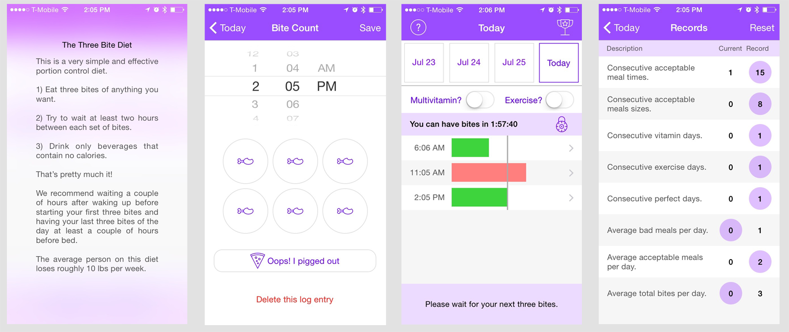
Screen Shot 2016-09-19 at 10.22.06 PM.png

Home Page

View your recent medical entries

How does my app solve this problem?

Entering doctor's visits is a breeze now. It only takes a few seconds.

Screen Shot 2016-09-19 at 10.53.58 PM.png

Entry

Adding a new medical entry only takes a few bits of data

I enter a very short description, just enough information to make my visit searchable, then enter the cost and, viola, it's recorded. You can now add pictures of any associated documents and you're good to go. 
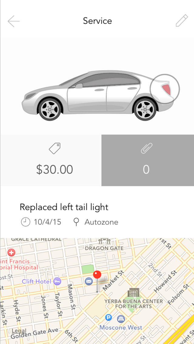
Images

After your entry is added, feel free to take pictures of receipts or documentation

Two items of note here are the avatar system and the calculated total system. 

Avatar System & Privacy

With the avatars, the idea is that you mentally assign an avatar to each person you're tracking medical history for and just tap that person's avatar for their entries. You don't enter their names or any other identifying data. Only you know who the real identity of the avatars is. When you are searching for documents later, you can quickly tap the avatar to bring up all of that patient's medical entries. 

Search

Look through your medical history for a particular entry or filter by person

Now, obviously, if you attach pictures of a bunch of documents with this person's name, and even their sensitive medical data then the cat is out of the bag, but that's completely up to you and how you wish to use the app. If you really wanted to keep their identity private, you can simply attach non-identifying photos like generic doctor's instructions or brochure information.

I made a very hard decision not to include any sort of registration and passcode system to access the app. This is due to several reasons:

  1. For me, at least, visiting the doctor, dentist or optometrist is incredibly rare. Maybe a few times per year, and I know that going into this app that infrequently almost guarantees that I'd forget my password.

  2. I find registering to use an app incredibly annoying and I typically delete those apps as soon as I'm presented with a registration screen.

I think most users will appreciate the simplicity of the app and not having to worry about that extra layer of privacy. I strongly encourage you to not use this app at all if your phone is easily accessible and not passcode protected.  If your phone is fairly secure, then I'd feel pretty comfortable using my app, because at that point it's not that different than storing document pictures in your photo library.

Calculated Total System

Years

Holds medical records for years

Why do I have a totaling system at all? Very good question, I mainly added this feature for 2 reasons:

  1. Medical tax credits. Don't worry, I'm well aware that you need to spend over 10% of your income on medical expenses before you can actually claim anything on your taxes but for some people that threshold isn't that out of reach. Furthermore, many states have their own medical tax deductibles that are more attainable.

  2. Isn't it nice to know? I never really paid attention to my medical expenses, but now this app lets me know if I'm spending more than I did last year at this time and by how much. Having knowledge like that could help me budget better.

Summary

Overall, I hope people find my app useful. As always, please email me through this site if you find any bugs or have any questions or concerns. 

Here's what's coming in version 2:

  1. One big concern I have is that you just enter a few years worth of important medical data, then you lose your phone and have no backup, that would be incredibly painful. I would like to have the app sync your medical information securely to iCloud. This will allow you to share the data between your other devices like iPads and if you do lose your phone you simply have to download the app again and it will return all of your medical information to you through your Apple account.

  2. Adding a passcode system is always on my mind. The drawback is that it requires creating a backend operation to automatically handle situations where people forget their passwords. I do hate registering to use apps so the passcode feature may be a user preference setting.

  3. It might be nice to be able to securely email some medical history data to a new doctor. Aggregating this document in a password protected PDF and ensuring secure delivery could be a useful feature.


Lori's Hands

What problem am I trying to solve?

Lori's Hands is a great volunteer program that connects college students with a bit of free time to elderly or unfortunately ill households who have trouble doing daily tasks, such as yard work or grocery shopping. While the students help out, they work towards lasting friendships and potential grants. As you might imagine, keeping track of all of the students visits every week, along with what actions they performed, is fairly cumbersome. Not to mention, printing out / writing down individual client info for each volunteer and supplying contact lists. With a little bit of upfront input and a helpful app, these problems can be solved.

How does my app solve this problem?

The app helps out in a variety of ways but the focus is on two things:

  1. Allow students to check in and out of visits and enter comments as well as what services they performed. They can see a report of all of their visits and know how they're doing when it comes to grant consideration.

  2. Allows the administrators can assign clients to specific students and view reports of their student's activities.

Launch

Just a nice collection of images to browse through if you haven’t logged in

Gaining access to the app is via special invite from the administrators and once the students log in, they don't have to re-login anymore unless they explicitly log out. This is to keep the app use very quick and painless. Students phones natively require authorization to access so adding a cumbersome second auth point in the app every time they open it is a bit too much. A lot of the client information is suppressed already, such as last names only being initials, etc.

The backend technology is Apple's CloudKit, which means that users who want to log into the app need to have iCloud enabled on their iPhones.

Home Page

List your clients and you can view students and your visit history

You'll notice that the main function after logging into the app is "Check In". This is done in a two step process. Checking in only requests a date, client and who your partners are. Once that's saved the "Check In" button changes to a "Check Out" button and they can check out via the screen below. Each of these steps only take a few seconds to perform.

One item of note is that all views throughout the app that take user input (aka, check in, check out, scheduling a visit, etc) all appear as blurred modals, similar to the screenshot below. This gives the app a very consistent look and feel when it comes to viewing read-only content vs entering data.

Visit

Adding a visit is pretty simple, just tap a few tasks and enter some notes

That pretty much takes care of the student's actions. A few other things they can do is view a client, along with their visit history. Here the student can call or email a client or their emergency contact, or they can get directions to the client's house. Clients are assigned to a particular student and that student can only view information about their assigned clients.

Client

Looking at client details get your access to emergency contact info and history of visits

Lastly, for students, they can view their profile to see a snapshot of how they're doing while working towards their grant.

Profile

Looking at your profile gets you a nice summary of your work

Now, you might have noticed a big "Admin" button in the profile area. This gives the administrators restricted access to an area of the app where they can add or edit visit, client or student information as well as see customizable reports of everything going on in their organization.

Admin

The app has an admin area that allows you to create clients and generate reports


Summary

The app is a fairly routine app that allows Lori's Hands administrators track and report on their volunteer activity. Working with this organization was such a great experience, allowing me to try out some new technology (such as CloudKit) for a great cause. 

What's next in version 2?

We're still beta testing the app and working out any inefficiencies but a few things that I know are coming are:

  1. Scheduling visits in the app interfaces with the iPhone calendar

  2. This app is surprisingly not Auto-Layout compatible. Now that stackviews have made auto layout significantly easier, I definitely need to go back and add that in.

  3. It would be great if the volunteers used the app for a bit of other stuff, other than just quick check ins. So adding a social flavor to the app is definitely on the drawing board.

Ride Paper

What problem am I trying to solve?

A couple of months ago a warning light glowed in my dashboard letting me know one of my tires was low on air. Like everyone else would do in this situation, I stopped at a gas station to fill the air back up. Sure enough, the light came back up a few days later and sure enough it's the same tire. I decided to stop at a tire shop on the way home from work and the assessment is that my tire needs to be replaced and the new tire will cost around $300. I was a little shocked. I know that I had gotten a tire replaced at a different shop around 6 months ago but I don't remember spending $300. Maybe this tire the same tire that I replaced 6 months ago and is under some sort of warranty? I had no idea. 

Then, a few weeks ago, my battery died. In Arizona, car batteries do not last long at all. Getting more than two years of life out of one is actually pretty good. So, again, like any normal human being, I went into AutoZone to have my battery tested and sure enough it needed replacing. However, I have no idea how old my current battery is. I "think" I bought it around 16 months ago, which means it might still come with the standard 2 year warranty? Also, if I did buy it 16 months ago and it's dead, maybe I should avoid buying this particular type of battery again. On the flip side, if I had purchased it 3-4 years ago, I'd love buy that same brand again. What did I pay for this battery before? Did the prices go up? Did I buy the cheap or the expensive model? The answer to these questions... I have no idea.

So, knowing what you bought, when you bought it and what you paid for it, when it comes to your car's maintenance and service, is actually something I feel is important to keep track of. I feel like if I knew that a tire I purchased 6 months ago at a different shop was 50% cheaper than this current shop (which it was), I would have been more inclined to head to that shop instead. Knowing if something's under warranty can obviously be a huge help as well. 

Someone had mentioned that they just scan their receipts and dump them on the cloud somewhere, arrange them in folders by car, then date them, etc. I can imagine if you quickly want to track something down, you'll have to do quite a bit of digging. You can't simply type "Battery" into Dropbox or Google Drive to find all of your battery related receipts. What if you're at the car shop (99% of the time when you actually need this information) and can't seem to get a cell connection? The problems could pile up quickly.

How does my app solve this problem?

Don't get me wrong, there are plenty of apps out there that do what Ride Paper do, but I've found them cumbersome. For example, the two apps below are very good apps in their own ways, but one requests your car's year, make, model, milage, license plate, nickname and vin number, which I think is a bit much. They all request that you take a picture of your car, which I find inconvenient because I'm never using this app while standing next to my car. 

Other

Way too many buttons on this screen and requesting too much info.

One app has "generic" services that you enter, but then it has special categories for "adjusting valves" and "checking tire pressure", as if we adjust our valves regularly and we should note when our tire pressure is fine? Maybe this app is for race-car drivers?

Other

Has presets for specific maintenance like adjusting valves

Very few of other apps allow you to take pictures of associated receipts, which I think is probably the most crucial aspect. The apps that do allow this are very busy and confusing, I'm not quite sure what some of these buttons do.

Other

A little bit too much data to enter and a lot of buttons. What does “set reminder do”? Why is that paper/pencil grayed out?

However, there are areas that other apps absolutely destroy Ride Paper. Some have the ability to take your make/model/year information and give you factory suggestions such as the 40k mile inspection etc. That is very useful information but beyond the scope of ride paper and it's information I receive already at every oil change. Other apps also build in gas milage tracking/calculation into their apps, which appears to be a demanded feature (based on the sheer number of apps that track milage/gas) but it's something I don't ever use so I didn't have the expertise to add it in an efficient way to Ride Paper. 

An app that will likely destroy Ride Paper is an upcoming one called Car Note. It looks like it's funded by Venture Capitalists and has very talented designers. Car Note probably saw the same issues I saw in the current batch of apps and is diving in with a much more full featured solution. I'm sure there are more ways other apps are better than Ride Paper, but let's focus on what Ride Paper does well and you can determine for yourself if it's worth downloading.

One of my concerns was how ugly manual pictures of cars look inside these apps. It's very difficult to design an app that looks good surrounding someone's garage photo. Furthermore, in order to quickly and easily find a specific service entry, I wanted to let the user to simply tap on an area of their car and have related services appear. To do this on a personal car picture, that they'll likely change frequently, is not optimal, so I purchased artwork that encompasses "most" body styles of cars in a side-profile view.

Car body styles covers a decent range of cars.

Car body styles covers a decent range of cars.

I then developed code that lets you color your body style appropriately and the end result is a car that "sort of" looks like yours, within reason. This won't work for everyone, obviously, because certain colors are not available (dark green, etc) and body styles are limited (sorry, Jeep fans) but I think this could handle most users depending on how picky they are.

Car

Select a car body style and color, doesn’t have to be your exact make and model, just close enough is fine

That's it, pick a body style and a color and you're basically done when it comes to adding your car to the app. No vin, no license plate, no milage, no year/make/model. Two things you can add to your car at this point are naming your car and adding notes. These areas are where people (if they really want to) can enter any special car information like the aforementioned items. For example, the user can write "2014 Ford Focus" as the name and simply use the notes for reminders like "Next oil change at 44k". Whatever they want to use the car name and notes for is completely up to them.

Home

You can give your car a name at the top or whatever you like. Add any extra notes here for this car.

Now, the next important piece is adding a service to your car. It was crucial that this be as simple as possible. No clutter, no asking for extra, unnecessary information, no specific forms for specific services. The only required fields are the date and a small description and even the date is pre-filled so the amount of effort needed to create a service is negligible. Adding a picture of a receipt is equally simple, just tap on the camera and there's an area of the service that you can attach up to four photos before you save. You can also tap on your car and highlight an area that the service took place. Why would you want to do this? It simply allows you to quickly filter your receipts later by tapping on areas of your car while you're looking at your car's history. If that feature doesn't seem pertinent to you, simply skip tapping on the car and your receipt will be "full bodied" and appear in every filter. 

Service

When you enter a service tap the area of the car that you serviced, this allows you to filter by tap in the future when you want to search past entries.

Photos

Add images to your service entry

If you want to, you can add some very brief info about the service location. This information is optional because it's already available on the receipt, so the only reason you would include it in the app is for a bit of eye candy (it would be very sparse otherwise). You can enter the shop name and if you toggle the "I'm here" locator, it will simply grab your GPS coordinates (only once, not continuously) and store it so that it can show you the shops location on a map. The idea is that most users will be handed a receipt at the service location and they'll want to add this receipt to Ride Paper right then and there and they can apply their GPS in this scenario. What if you entered the service at home later and want the shop to show up on the map? Sorry, you're out of luck. The idea is that you wouldn't be spending several minutes filling out the shop's address and what not to every service, it's meant to be so quick and painless that adding a service receipt on the spot in the shop should be second nature.

Details

View your service details later

Finally, the only other benefit of the app is giving you the ability to very quickly comb through dozens of services and repairs to find exactly the one your looking for with just a single tap of your finger. While looking at your car's service history, tapping on an area of the car will only bring up receipts you've labeled for that area. Need to find the receipt for that back tire you replaced a year ago? Tap on the back tire and there it is! Need to find the receipt for those dents you got hammered out of your bumper? Tap on the bumper and viola!

History

Tap your car anywhere to search by that region

All of your car history is stored on your device and can be brought up quickly without any type of internet connection.

Things that are coming very soon are:

  1. The ability to backup your services to iCloud. This means that if you lose or damage your phone, you can re-install Ride Paper on your new device and all of your old receipts are pre-loaded.

  2. Wouldn't it be nice to give someone a complete service history when they buy your old car from you? I'm hoping to implement a feature that allows you to email someone a PDF version of your car's service history.

  3. It would make sense to have some sort of Overview area of your car maintenance. It can tell you how much you've been spending broken down by time periods.

Summary

In conclusion, Ride Paper is an app with a very specific and niche use case. I don't expect it to solve everyone's needs but I think for a large portion of us that don't obsess about our cars and just want some very simple and basic repair or maintenance tracking, this app should really come in handy.

Three Bite

What problem am I trying to solve?

I've always had a problem with diets.

I'm not obese by any means but I'm a fairly hefty individual and I do suffer the mental anguish that comes from looking into the mirror and remembering the good ol' days when I had a presentable body. 

The problem I have with diets, and I'm absolutely certain I'm not alone, is that I love food too much. I can't do low carb because if I see a plate of nachos, I cave in. I can't count calories, because when I drive by any McDonald's I have to stop for a caramel frappe. The taste of my favorite foods will ultimately cause a failure in any diet.

However, there's one diet that is not a lost cause. It's one that is detailed in the book "Why Weight Around?" by Dr. Alwin C Lewis. It's essentially based on the idea that what you eat doesn't matter as much as how much you eat. It's a diet based on gastric bypass patient meals after surgery.

Dr Lewis' diet (called The Five Bite Diet) allows you to eat five bites of anything you want for lunch and five bites of anything you want for dinner. Don't drink any calories. That's it. You're done for the day. On the bright side, I can eat five bites of ice cream and pizza and not feel guilty, but here are the problems I have with this diet:

  1. That really lengthy time between your 5-bite dinner and the next day's lunch is pretty difficult to pull off.

  2. The Five Bite Diet doesn't really recommend any sort of work out regimen. For a guy like me, who plays sports several times a week, have only two 5-bite meals puts a real damper on my energy levels and performance.

  3. This diet can be unhealthy, obviously, if you choose to eat five bites of big mac every meal. Since that's "technically" still following the diet, it's fine, but Dr. Lewis recommends having a multi-vitamin every day to help alleviate any nutrition gaps.

In order to make this "eat whatever you want" portion diet idea more manageable, I decided on a work around. The Three Bite diet allows you to have 3-bite meals more frequently throughout the day. When can you have them? It doesn't matter, as long as it's been at least two hours since your last set of bites.

Three Bite vs Five Bite

Three Bite allows you more bites, more evenly spread throughout the day

Why three bites, you might ask? I didn't just pull this number out of my head, it is based on the 3-Bite Rule, explained here by shape.com's Beth Blair

Then I remembered the three-bite rule: When you really want to indulge, limit yourself to three bites. Why? The first bite is as good as you think it’s going to be, flavorful and delicious. The second bite is also good but not as good as the first bite. By the third bite, the food isn’t going to taste any better, so you might as well stop.

Also, doing exercise should actually subtract from your bite count for the day so that you can over-eat by a few bites to gain the extra energy needed to perform well in sports. This also gives you a method to work around accidental cheating, in turn, encouraging you to hit the gym a bit more.

Now that this new diet is defined, the real issue is how to track it? Unlike the rule of eating five bites for lunch and five bites for dinner, this diet requires you to remember precisely what time you ate so that you can figure out when two hours passes and you can eat again. Also, if you over-ate a little at lunch, how do you keep track of your bites to know that your exercise is making the appropriate adjustments? How do you make sure you don't forget to take a multi-vitamin? 

That's where the app comes in.

How does my app solve this problem?

I created the Three Bite app specifically for the diet described above. The main features are that it allows you to enter your bites at a given time and then it displays a timer, letting you know when you're allowed to eat again.

It also lets you add exercise to the mix, which adjusts up to 3 bites of over-eating that may have occurred that day. 

Exercise

You can adjust any over-feeding down by exercising

Lastly, it gives you a way to ensure you're taking your multi-vitamin every day (see bottom left corner next to exercise toggle). 

While the app only lets you review the last week's worth of bites, you can see an overview of your entire progress to see how many meals you've cheated on and how often you're doing well. 

Custom

Tweak the sliders to come up with your own eating system

As an additional feature, you can adjust the settings in the app to track a different number of bites and set your own wait times and exercise features, if you have a particular portion control diet you want to try instead. Many users actually use this app to track their Five Bite dieting. 

Summary

The Three Bite Diet isn't perfect. I have to admit that it's biggest flaw is the fact that, since you eat so often throughout the day, it gives you many more chances to cheat at each meal, compared to Five Bite. For people who are weaker willed (such as me) this is a bit of a crux, but I'm powering through it. 

My app, Three Bite, is available on the App Store for free. There is no monetary benefit for me putting this out there, it's just an app that I try to use regularly and am happy to share it.

If you have any issues or comments, feel free to send me an email from my About page.

Volunteering Your Skills

I remember back when I was a mid-twenties whipper snapper, I had read an article about polyphasic sleeping that sounded too good to be true. The gist of it was, after two weeks of discomfort, you can actually train your body to function normally on 15 minutes of sleep every 4 hours. This means that you are awake for roughly 22 hours each day! When I mentioned trying this to my friends, they all asked the same question.

"Why?!?!" 

To me the answer was simple, "I need more free time!" 

I think the appeal of 22 waking hours per day is exclusive to people who actually have 22 hours per day of things to do. If my daily job was, for example, a butcher, I could not "butch" stuff for 22 hours per day. Not only is this impossible with store hours, but I don't think it would benefit me in any way, save gaining a few extra knife tricks. Same goes for being a manager at the Gap, a telemarketer or being a school teacher. Having extra free time is not a complete lost cause in those professions but, as a developer, this is particularly useful because of two things:

  1. You get to learn new technologies.

  2. You get to create your ideas.

These items are instrumental in shaping a programmer's career path and unlike many professions, we actually consider this side work "fun". 

Ultimately, I didn't pursue the glory that comes with 22 waking hours and now I've been stuck with "regular" hours like common folk. It's difficult to get this point across but I hope that the fact I was contemplating sleeping for 2 hours each day gives you a general idea of how valuable free time is to a developer. As I get older, free time is becoming more and more elusive, so, with what little free time I have, why in the world would I volunteer my skills to non-profits?!

Your Ideas Suck

Sorry, it had to be said. Compared to the work you could do for a non-profit or charitable organization, there's a very good chance that your own idea isn't quite as useful to the world. 

In this age of mobile and web, technology advances at such a blinding speed that every time you consider, "hey, having an app that does blah might be cool", you'll quickly realize that there is already 20 apps that do blah on the app store. Mind you, the apps I'm talking about are solo project apps, ones that don't require 8+ months and a team of 4 to get off the ground. Obviously, there's still a market for difficult apps, but for any app that you, yourself, could accomplish alone in a "reasonable" amount of time, the pickings are slim.

App stores are growing exponentially so there are fewer and fewer good ideas that you can create on your own.

App stores are growing exponentially so there are fewer and fewer good ideas that you can create on your own.

Developing an app that, for example, helps restaurants donate food to the hungry is probably a better use of your free time compared to developing an app that texts people "Yo" or another To-Do List. I'm certain your ideas are better than these but would they be more meaningful than an charity app that helps kittens find a home? Sure, if you volunteered your time, you won't strike gold by creating the next Twitter or anything but as the graph shows above, the odds are is already pretty slim and getting slimmer every day.

Volunteering with a non-profit will give your work depth and meaning in a way that many of your own ideas do not. 

It's Relaxing

I may just have gotten lucky but thus far the organizations I've been dealing with are very reasonable, have low expectations and don't really have a lot of demands. They know you're using your free time to try and help them out so they're very understanding.

Do you have a feature that might get cut because you're running into some time constraints?

They're ok with it.

Do you want to use a specific technology in their app because it's something you're interested in learning?

They're ok with it. 

Do you have some ideas that will make their app better?

They're ok with it.

It's a very easy going process and you likely won't feel pressure or anxiety while completing the project, which ensures the fun of learning new technologies doesn't dissipate.

Pad Your Resume

Any work you do for non-profits or charities are things you should mention in job interviews and employers love hearing about them. It shows that you're eager to learn new technology, you're not afraid of a little extra work and you care about helping those around you. It also shows that you can handle full stack work and be a lead developer or architect on small projects.

Most resumes and enterprise websites like LinkedIn have special areas for volunteer work or special projects, be sure to use that space extensively.

How Do I Get Started?

I hope you can agree that, as a developer with some free time that's interested in learning new technology in a way that both makes the world a better place, and advances your career, volunteering is the right track for you. Let's talk about how you get started.

While it's possible to find some non-profit or charitable work on one of the many freelance websites, I found that going through www.catchafire.org was the best experience for me. Not only is every posting on their site a non-profit or charity, they also pre-screen the projects that are posted and ensure that the organizations have sufficient backend technology in place and/or IT staff on hand to help you do your job.

Give it a try and I hope you have the same great experience that I did.

Re-Designing Three Bite

Three Bite is a portion control / diet app has been in internal beta for a quite a while now, almost two months. The main purpose of the app is to regulate the user to eating three bites (of anything) every couple of hours. 

While all of the bugs have been resolved and it's ready to submit to the app store, I was never quite ready to push it through. The reason was mostly asthetic. It functioned well and got the job done but it looks incredibly plain and boring. I'm not a designer, I'm a programmer and I've always been staunchly in favor of having professional designers create a "theme" for an app that we can work from and this case is no different.

Since my app was ugly and built mainly for myself, I was content with just leaving it to rot away on my personal iPhone in infinite beta. This was until I stumbled across the Do UI Kit from invisionapp. It was free, stunning and perfect for a simple 4-view app.

Choosing a Theme

It took roughly an hour of going through the UI Kit's 140 different views to find 4 views that I felt could be repurposed to replace the 4 views I'm using now. 

Do UI Kit, theme 2.

Do UI Kit, theme 2.

Original app design.

Original app design.

You can get a decent idea of where I'm going with these already but allow me to explain.

Help View

This view is used multiple times in the app to display information to the user in a blurred modal overlay. Tapping on the question mark or the "Exercise?" and "Multivitamin?" buttons should reveal what they're all about. 

Informational / help views in original app.

Informational / help views in original app.

Most apps now have a "walkthrough" system that tells you how to use them, so this concept became more intriguing to me. Why not just let them tap through a few views and get everything they need to know about the app at once, rather than having 3 separate buttons launch 3 different information screens?

This was the easiest view to implement. Tapping on the question mark pops up a modal and I dumped 3 views onto the storyboard with a button segue between them and a dismissal at the end. 

New help / informational walkthrough.

New help / informational walkthrough.

The whole process only took a minuscule amount of time but it’s a little archaic so I know what you’re thinking, why not just use a page control?

The first problem with using a page control (other than some believe that it's an Apple UI Guideline worth avoiding) is how do they dismiss the modal? We can allow the user to tap the screen to dismiss it but then you open yourself to those pesky “I meant to swipe to the next page, not dismiss it” touch conflicts. So I’d have to add a dismiss button somewhere and make sure it appears on every page or that it resides outside of the page control. The main advantage of having a page control is to “clean up” the interface of any “next” buttons so adding a “dismiss” button instead seems like a wash.

The second issue is that page controls are a bit of a pain to implement. They’re not bad but they're tedious to get the content set up and ensure that the page control’s indicator is “in tune” with what it’s displaying. If implementing my 3 view push took a small amount of time, a page control is comparatively harder for a minor benefit.

Home View

The home view is the main landing page, which lets you look at bites over the last week, the meal timer and toggle Multivitamin and Exercise tasks as you perform them. 

I removed the switches and opted for the Android style floating buttons at the bottom. I subsequently had to ensure that the bottom of the meal table can scroll above them to be fully legible when there’s a lot of entries.

In the original app, the idea was to display an encouraging / helpful message at the bottom depending on what the state the user is in. For example, if you are eating well so far, it would say something like “Great job, don’t forget your multivitamin!” or if you’re looking at older dates, it gives you a summary of how you did “Pretty good job of tracking your meals but let’s try to limit the over-eating.” In hindsight, this idea cluttered the interface and the benefit it provided was not worth the effort it took to write the logic that determines which message to show when.

The timer wasn’t very large in the old app so it now displays prominently at the top. Another thing is the old app didn’t show you the timer when you were looking around at previous days (since there’s no timer for that day). That also didn’t make sense so now the timer displays constantly once triggered.

Lastly, in the old app, when you would invoke the exercise switch, it would remove some extra bites and indicate that the meal was affected with an icon. Now, it simply makes the removed bites slightly transparent, which is cleaner and the user can better figure out what's happening to their meals.

Toggling exercise button trims down some over-bites.

Toggling exercise button trims down some over-bites.

Bite View

This view is used to actually make the bite count entries for the app and, as you can see, it was largely unchanged. 

I removed the save button and it now saves changes automatically when you leave this view.

The date was added, since it wasn’t there before, to help prevent the user from accidentally making an entry for an older day (which happens to me quite a bit). 

The delete button was removed, you now delete meals by swiping left on them from the main page. This is fairly standard and test users figured it out quickly, so this change didn't cause me any worries.

"Oops! I pigged out" was renamed to "Over-ate". I know there shouldn't be a dash there but during testing users kept asking me what the "Overrate" button does. "Does it mean my meal was overrated?" Adding the dash seemed to solve the problem.

Summary View

This view was the one I was originally the least happy with. The purpose for this view was to give people some “achievements” to strive for, where they try to beat their own historical entries and encourage them to use the app more. The problem is, not even I cared about this view. There was too much reading and there were a lot of times where my historical goal was so good that my current progress seemed hopeless in comparison. It was almost de-motivating, in a sense.

So the new view threw out that old “achievement” concept and just gave you a summary of how you’re doing so far. The idea came from the UI Kit itself, so I’m thankful. 

The only tricky component was getting the percentages correctly animating in the circle at the center of the screen.

What’s Next?

For my purposes, the app works just fine. However, I do know that other users on the App Store will likely want to tweak the settings. Perhaps they want to track five bite meals instead of three? Maybe they want the wait time for each bite to be lower? Maybe a particular user exercises very hard and thinks the toggle should remove more than just three bites? This is all easy to implement and I’ll likely get these customizations in there when I come across some free time.

Other than that, I’d like to try this diet a bit more personally. It’s based loosely on “The Five Bite Diet” made famous by Dr. Alwin C. Lewis in his book “Why Weight Around?”. The purpose of the Three Bite app is to relax Dr. Lewis’ bite restrictions slightly and spread them more evenly throughout the day. While I’ve had some success with Three Bite, I admit it has its weaknesses, primarily that you have so many meal times in a given day resulting in that many more opportunities to cheat.

Look forward to a future blog entry with results from a week of following Three Bite religiously while trying to max all three activity bars on the Apple Watch every day. Dr. Lewis' Five Bite Diet brags about losing 10 lbs per week, we'll see if I get even close to that on Three Bite.

The Two-Step Design Process

As developers, we absolutely love when the boss approaches us with news that they’re adding a brand new feature or module to the app or, even better, they want us to create an entirely new app with a particular solution in mind. For the next week or so, developers will be caught leaning back in their chairs, glassy eyed and dreaming of all of the garbage code they wrote (or have to deal with) in the existing app that they can make cleaner and more efficient in the next app. Technically, they’re in heaven. (Bazinga!)

While I could go on an on about the intricacies of how good code inevitably turns into garbage over time, that’s not what this particular post is about. This post is about the two often underutilized steps of the design process that’s allowed me to be successful in implementing most new modules at a high level and ahead of schedule.

The Quick Sketch

"Make me some mockups of the new app.”

This is what my supervisor said to me after sharing the details of how the app is going to work and what problem it’s trying to solve. So after a day of sketching, I gave him something like this...

A few examples of quick sketches to flush out the basic design concept.

A few examples of quick sketches to flush out the basic design concept.

“What is this? I want mockups. This has no detail at all.”

He went on about how he wants to see real data on the mockups, wants to know where every field is going to be laid out almost down to the pixel and see every icon in all it’s glory. We then embarked on a lengthy argument.

What I was trying to explain to him is that design is a two-step process. The first step is going over some very quick and very rough sketches to lay out the most basic idea of how the information will flow. This is where you make the a lot of the technical decisions; does it use navigation controllers or tab bars or a split view? What are the visual differences between the iPhone and iPad versions? What’s the authentication flow? Do you need any custom controls?

It could take a week to create a full app mockup with the level of detail that my supervisor was requesting, all the while not knowing if the design direction is the correct one.

In this particular instance, I’m glad I didn’t work on the detailed mockup because we ultimately ended up going with a completely different design direction than the one I was pitching. If I had taken a week or longer to create a detailed version of my design idea, one of two things would have happen:

  1. We would have quite a bit more time invested in my design and it’s harder to back away from it, even though it may ultimately be the wrong decision for the customer.
  2. We would decide to go with a different design, wasting that week’s work.

All of this could have been avoided by simply going over the quick sketches and making some key decisions before moving on to the next phase.

The Prototype

A typical “new” project usually consists of this type of time allotment:

Typical New Project Time Allotment

This means that if you have 100 days to work on a project, 20 days should be spent designing, 50 developing, etc.

I believe that the time allotment that works best should be closer to:

Recommended New Project Time Allotment

Crazy, I know. How in the world can anyone create anything with a 20% development time?

This time arrangement might not work optimally in all programming jobs but in jobs like mine, related specifically to enterprise iOS development, it’s pretty darn reliable. 

Have you ever used mockup or wireframe tools before? There’s hundreds of them and many of them are even specifically built for mobile app projects. But it still takes hours to tediously design all of the views for a standard application, and even more hours linking them all up to have them function in a way that “sort of” gives the end user an idea of how the app might work. That’s great, the end user can request changes and you spend more time tweaking these wireframes. After a few rounds of revisions, he gives you the thumbs up and you’re ready to start programming.

What happens to these wireframes you spent weeks on? Well, they’ve done there job, now they guide you as you start to develop the app from scratch. What if these wireframes were actually usable code that you simply drop into your application? That, my friends, is iOS storyboards. 

iOS storyboard prototyping is significantly better than wireframing because:

  1. This isn’t a wireframe, it’s a working prototype. The behaviors that the user sees on their device are exactly how the app will function once it’s finished.
  2. Storyboard prototyping, in my experience, takes roughly the same amount of time as wireframing a comparable end product but all of that design time is actually development time, since these same storyboards will be utilized in the live application. 
  3. Any “issues” with UI design are being handled during the prototyping phase and not mistakenly promised to customers just because the wireframe tool had a nifty feature you wanted to show off.
  4. Every iteration you perform on a wireframe is time not spent on development, so it’s critical to keep these iterations down to a minimum. However, iterations performed on a storyboard prototype is development time so this allows you to perform more iterations than you normally would to ensure the best possible product before the deep development starts.

I can typically get a fully functioning prototype to an end user in about a week, even for a fairly large app. Here’s a snapshot of the quick storyboard prototype I put together for Lori’s Hands, a non-profit volunteer network.

Storyboard prototype of Lori's Hands App

Storyboard prototype of Lori's Hands App

All of the data that is displayed are simple hardcoded dictionaries. Almost all of the buttons function exactly as they will in the actual app, informing the user how each data point will look and how the app will flow. 

The only item I typically avoid at this point is passing data between views, for example, when you tap on a particular client on a list and the next view that slides in has information for the client you tapped on. In my prototypes, the data is hard coded so the same client information will appear no matter which client you tap on throughout the app but users can typically see past this and understand what’s going on.

At this point, the user can come back with as many visual requests they want; changing animation speeds, moving buttons or swapping icons, re-arranging the data, etc and all of these changes go directly towards development time and end up in the final application. 

Once they’re happy with the prototype, you dedicate that focused 20% of development time to swapping out the hardcoded data backend with a data connection or database then add business logic and validations.

Conclusion

The initial quick sketch portion of the design phase is common knowledge and works in all development environments but as I mentioned before, this rapid prototyping design phase is likely exclusive to iOS development (probably doesn’t even translate well to iOS video games). However, if you work in an environment that can pull this off, I encourage you to try it and measure your results.