Gift Hound Finally Updated for the Holidays!
Well, I finally decided to update Gifthound after, like, 2 or 3 years. Why? Well, I actually decided to download and use it to track gifts for the family this holiday season and WOW… either my eyes have gotten really old (likely true) or the colors I picked in my app design were terrible (likely also true).
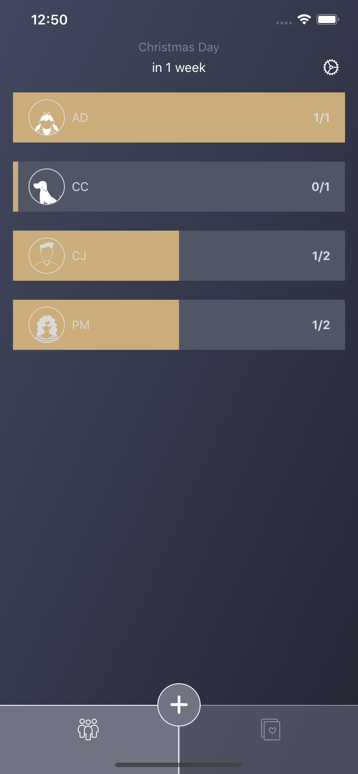
Here’s an example:

I usually have an iPhone mini but I recently upgraded to the iPhone 14 Pro and this larger screen really makes everything on the screen seem tiny.
The actual functionality of the app is really good, I would say probably one of the best gift tracking apps on the app store, but everything was just really hard to read. White text over light yellow colors?! Light gray text over light blue backgrounds?! What was I thinking? This was an issue on a lot of the views.
The revamp increased the weight of the important text, added high contrast colors and increased the size of all the icons. This makes things much easier on the eyes.
Also, with the old app, “tappable” items were white… but a lot of non-tappable items were also white, so this didn’t make it very clear as to what was tappable and what wasn’t. A common complaint I had was someone not knowing how to set a custom event, like, a birthday or anniversary (tap the text under the holiday name at the top). I feel like the new app is a bit more intuitive.


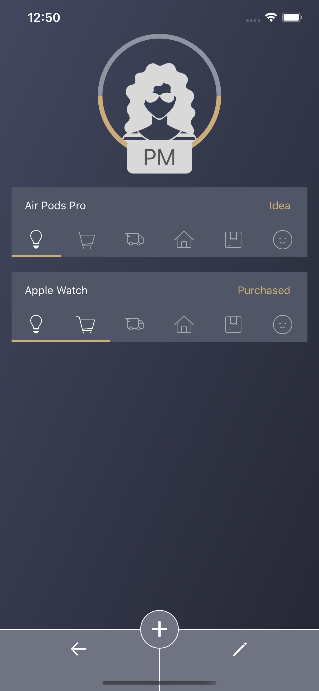

The above is a few other examples of the improvements in readability.

The insert/edit gift interface is cleaner and easier to use now. The tap targets here used to be so small.
Lastly, 2 more things bothered me about the old app.

One was this weird “Settings” button that only appeared in the recipient list. So when you’re naturally toggling between gifts and recipients, this ugly button would disappear and reappear.
The purpose of this button is to change what gift status is considered “Done” for recipients. This was needed because, personally, I consider the gift “Done” for a recipient when it’s “Received”. Someone else may not consider it done unless it’s purchased or wrapped?
Anyways, based on the above, it’s obvious this button would only every be used once or twice for the lifetime of the app. The user would set what Done status they want and never change it again. So having this slapped on the main page was silly. I made the decision to move it to the App Settings instead.

To be honest, this App Settings plist was a huge pain and I feel like this hasn’t been updated since, like, iOS 3 or something? Horrible… but it got the job done.
The second thing that bothered me was how you can tap on the icons on the gift list to pop out menus to either go to the recipient details or to change the status of a gift.

The problem is, it would just pop out a menu with only icons in it and it was difficult to discern what they represented.

I updated the menu to use Apple’s new UIButton.menu (UIMenu) system and it worked great, saved me tons of code and extra view controllers.
In conclusion, I don’t think many people were using the app to begin with, likely because of how hard it was to read. When I searched for “Gift Tracking” on the App Store, my app was wayyyyy at the bottom of the list. I’m hoping with these updates, maybe a few more people will give it a try and it will climb up the search rankings a bit.