Jaunt

What problem am I trying to solve?

My last three jobs all had the same issue. I was part of an engineering team but, as most desk jobs in the IT industry, there’s quite a bit of “work from home” (WFH) and "paid time off” (PTO) going around. This is fairly typical but being a senior member of the dev team meant I was in charge of quite a few meetings, such as design discussions and code reviews. After scheduling a meeting for the 4th time where several of the main participants were either WFH or PTO I was pretty annoyed.

Secondly, an important aspect of seeing the upcoming vacation plans for a team is that we try to ensure we have enough coverage when people take time off. Obviously, it would be a big problem if, for example, the 3 iOS devs on the team were off the same week (this has happened once before). Don’t we have a shared work calendar where everyone posts their PTO? Well, yes, and no. In my experience, not everyone remembers or likes posting to this calendar (maybe 50%) and not everyone likes having teammates PTO entries sprinkled throughout their workweek events. Also, our work calendar is not accessible on our personal mobile devices so we can’t check it on the fly without being at our computers.

Third, my current company has “unlimited PTO”, which is a hot new Silicon Valley system that basically only requires manager approval for any sort of leave. This kind of policy can lead to some abusive habits and, likewise, some burn out if people aren’t taking enough PTO (yeah, actually pretty common on this system). Giving admins some insight into these numbers goes a long way.

Now all of the above scenarios may really just be my personal experience at my last few companies and it’s possible the world doesn’t need a Jaunt app, either way, it was fun to work on this app.

How does my app solve this problem?

The requirements I had with Jaunt were basically these:

  1. Adding time off entries to the app should only take a second or 2

  2. I need to quickly see upcoming vacations for people on my team

  3. Come up with an enrollment mechanism so that coworkers can see the same data

  4. Add some YTD summary data and charts so we can quickly look at PTO usage

Adding entries as fast as possible

For this, I didn’t want to go the standard iOS calendar popover route, I decided to try and design something new. In hindsight, after using my date entry for quite a while during testing, it’s a bit of a pain. Left/right swiping is not nearly as convenient as up/down. So while my date UI takes up a bit less room than an iOS UIDatePicker, it’s not as efficient.

I did add some small touches, like, if you select a start date, the end date auto-adjusts to match and trying to keep all of the editable controls on the lower half of the device (for one handed use).
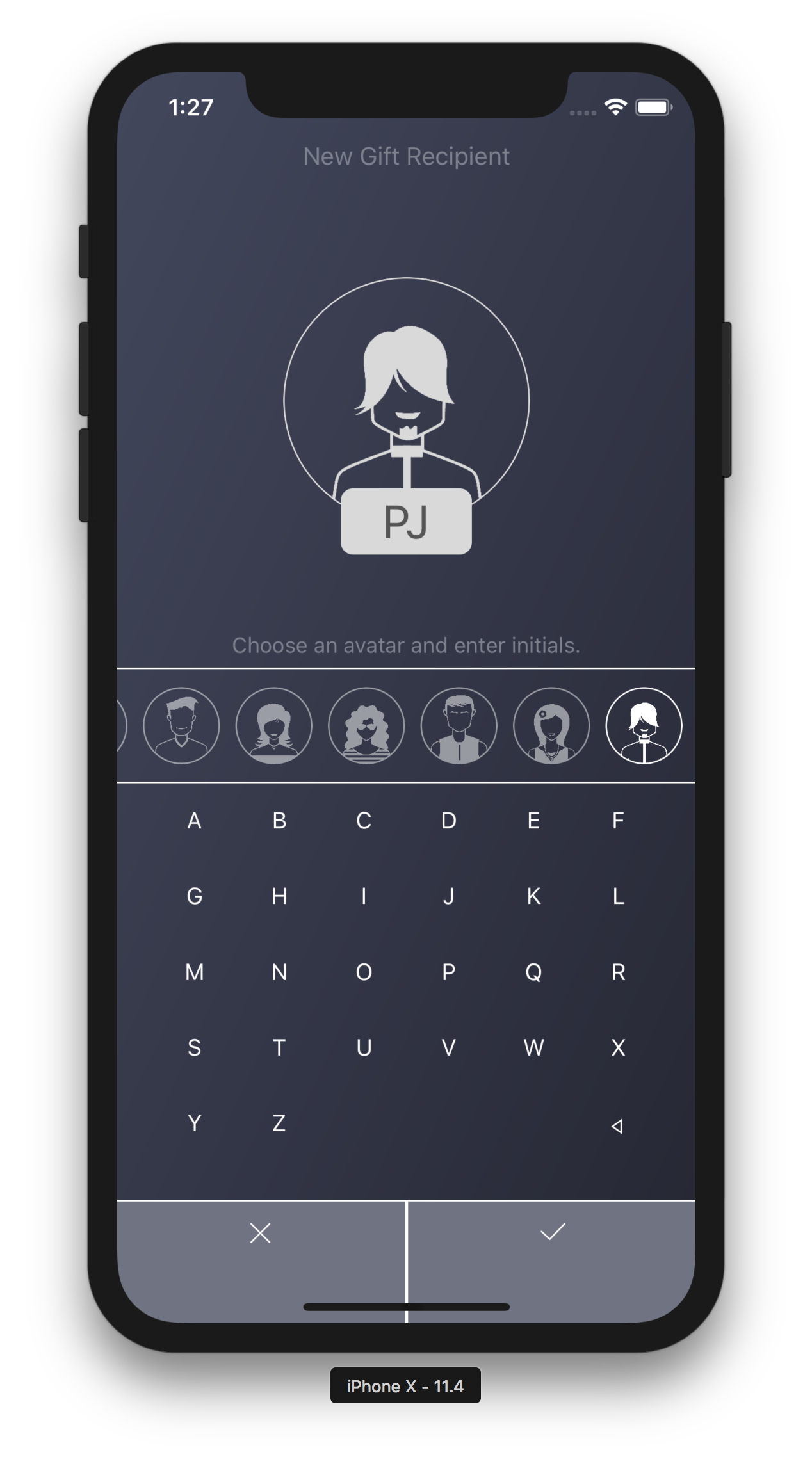
Screen Shot 2019-07-15 at 8.07.32 AM.png

Entry

Creating a new Jaunt entry starts here

Also, you’ll notice there’s no text entry anywhere, basically, date 1, date 2, toggle, done. A lot of friends I’ve spoken with said it would be good to give a reason for your WFH, for example, “Have a plumber coming to fix my sink” or PTO = “Going to Hawaii, suckers!”, however, this is something I was not interested in from the start. It adds friction to entering out of office data and I think it provides little value, as you should have already gotten your time off approved by your manager (and shared your reason with them personally) before entering it into Jaunt.

Quickly see upcoming vacations, but only for people on my team
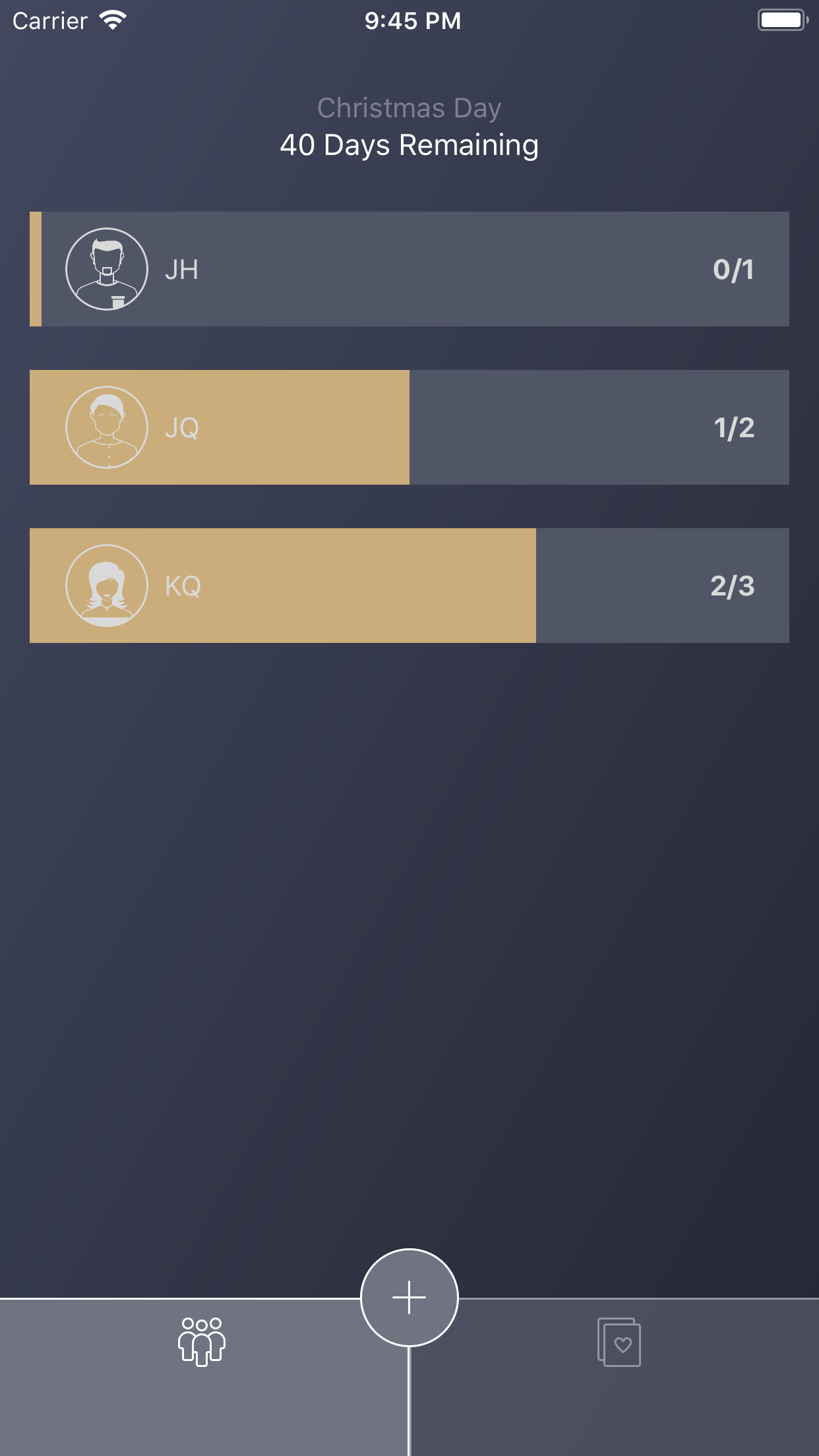
Screen Shot 2019-07-16 at 7.49.12 AM.png

Home Page

Launching the app immediately shows me who will be out of the office and on what dates.

Screen Shot 2019-07-16 at 7.49.31 AM.png

Following

Tapping the purple number next to the search bar (number of people I’m following) will take me to the UI where I can select who I want to see vacation time for on my home page.

Come up with an enrollment system

At this point, I want a way to enroll coworkers/employees into an organization for these 2 scenarios:

  1. Easily enroll everyone you created profiles for

  2. More securely enroll one employee at a time

I came up with a Passkey system.

You can generate a passkey for an individual, send them that passkey and once they enter it into Jaunt they are in. Simple.

However, what if you have 20 employees in your department? Do you really want to generate 20 passkeys and send them out one by one? Of course you don’t. There’s the option to generate an organization passkey. You can send this single passkey out in a large email blast to all of your employees. When they enter the passkey into Jaunt it will present them a list of unenrolled profiles you created. They select themselves from the list, confirm and bam, they’re in. Obviously this org passkey system is a little less secure, so be sure to use it in trustworthy groups, but at least there’s an option.

Screen Shot 2019-07-16 at 7.55.48 AM.png

Passkey

You can generate a passkey on an individual or an organization

Passkeys expire 7 days after creating them.

See a summary of PTO

This one was a tricky one. Summary data is important for any good organization to have but when I mentioned this to coworkers they said, “I don’t want all of my workmates snooping through my PTO!”. And this makes sense, so the ability to see this only goes to Admins, which should be the group leadership.

Screen Shot 2019-07-16 at 8.08.47 AM.png

Data

Summary of PTO and charts can only be seen by admins

So what can a regular user see? They can only see upcoming time out of office, no past entries, graphs or totals are visible.

Summary

Currently the app is very niche. It considers only Monday - Friday workweek, it doesn’t handle holidays, it doesn’t notify you when new entries are added or someone’s PTO is about to start, you can’t filter to see vacation requests for a specific date range, etc. It’s definitely meant for small teams or departments who are having trouble keeping track of when everyone is out of office.

I have a host of new features I want to implement so I’ll keep working on this. If you want something specific for your company, please contact me and I’ll see what I can do.

Gift Hound

What problem am I trying to solve?

This is the usual "I want to do something but there's no free simple app that does it (without ads)" scenario.

I was hunting for a gift tracking app for Christmas so I downloaded a few free apps and many of them were pretty complex, where you had to fill in a bunch of info for each event you wish to track (I usually only need to track gifts a few times per year and I rarely need to track multiple events at once) plus you need to enter a budget and take a photo of the gift, etc. Almost every free app looked terrible or had ads or an in-app purchase for a required feature. 

I figured I'd spend a week putting together something simple that I would enjoy using and throw it on the app store in case anyone else was interested. 

How does my app solve this problem?

For simplicity sake, I only track one event at a time. Typical events like Christmas, Valentine's Day, Mother's Day and Father's Day are just built into the app. Depending on when you download the app you'll see whichever of these days is coming next. 

Let's say you have your niece's birthday coming, just tap the days remaining at the top and change the current due date and the days remaining will update appropriately. No need to enter names, budgets, etc for the events or anything, just set the date and start tracking. 

The two initial screens, list of gifts or list of recipients, can be toggled at the bottom, both have progress bars showing either the gift status or how many gifts you have left to buy for someone. 

Simulator Screen Shot - iPhone 8 Plus - 2018-01-04 at 21.45.11.png

Gifts

Progress on how far along you are on each gift (from idea to wrapping)

Simulator Screen Shot - iPhone 8 Plus - 2018-01-04 at 21.45.14.png

People

Progress on how far along you are on buying all of their gifts

Now, I wanted recipient creation to be the easiest thing in the world so you basically tap an avatar and then enter 2 letters for their initials. A few things to note:

  1. The keyboard is built into the view so it's not using the iOS keyboard. This is because the standard OS keyboard intrusive and ugly for simply entering 2 letters and it also requires me to validate stuff like non alpha chars, etc. This way everything is clean and fast.

  2. If you follow my apps you should know by now that I usually build my apps specifically for one handed use. There's usually no actions appearing above the halfway point of the screen.

Screen Shot 2018-07-22 at 1.27.23 AM.png

Person

Creating a person is as easy as selecting an avatar and typing 2 initials.

Creating a gift is the same way, just enter the gift name, tap one or more recipients and you're good to go. I added a gift note, but that's optional and it was only added because the screen was so empty and I needed to fill that real estate up with something.

I made sure there was no price field in the app, I think most users can figure out how much they're spending on people just by looking at their gift list. There's no need to start clutter up the app for something that provides little value. 

Screen Shot 2018-07-22 at 1.28.22 AM.png

New Gift

Creating or editing a gift requires on a few inputs, should be done in seconds.

One of the most important elements of the app is that each view is complete in the sense that you can do everything that you need with respect to what you are looking at. If you're creating a gift and didn't create a recipient, no problem, just create one in the gift interface. You don't need to exit, go back, create a recipient, then try to create a gift again. Same with deletion, you can swipe on any list to delete or tap to edit the item and delete it that way. It's very intuitive. There’s more than one way to perform all actions and the user should never have to backstep to accomplish something. 

Summary

Some other things of note about my app are:

  • I'm using a weird tint system. Typically an app has one color to represent anything that's tappable. In my app it's sort of white, however, white is also used for most informational display. When in edit mode, I try to color something user entered yellow so it's different than labels and actions. I think it's a bit unorthodox but ends up being intuitive once you start using it.

  • I have a note to add more icons to the app, some for toddlers and babies and even cats or dogs, however, icons don't currently exist that match this design so I'll have to get some made.

Hopefully someone other than myself finds this app useful. As always, if you have any questions of comments feel free to leave me a note.

Body Stack

What problem am I trying to solve?

So, I recently took up fasting... you can probably tell by looking at the trend in apps I've been creating. I started with Three Bite, which is eating three bites every 2 hours or so, then went to Daily Fast, which is intermittent fasting (basically just eating dinner every day) and now I'm creating Body Stack, an app that tracks your progress during speedy body transformations. I created this app specifically for extended fasting, but I'm sure it works well for others in different situations (keto, gastric bypass surgery, etc). 

Extended fasting is very hard. After several attempts the longest I've fasted for is 3 days so far. It's not the fasting itself that's hard, it's that there always seems to be someone's birthday or event going on or something emotional that derails me (stress at work, anger or sadness about something in the news or in my family, lol). So I wanted an app that motivates me to keep on track and stick to my goals.

Other weight/fitness/diet/body tracking apps seem to be a bit cumbersome. Many ask for stuff like body fat percentage and your skeletal muscle mass? Some require up to 5-6 fields for every entry. Here is what I want in these apps:

  1. Reminder Alert. I always forget to take photos or add an entry, setting a daily reminder will get me into a routine and keep me on track.

  2. Before and After photos. When I snap a new pic of myself, I should be able to tap once and compare it to my original photo to see how I'm doing. Before/After is super motivating.

  3. Trend Spotting. While I am dieting, I like to add certain types of exercise here and there, but I want my chart show me how these exercises affect my body. I'd like to know which types of exercise are getting the best results.

  4. Cycling through old entries and progress should be as easy as a swipe.

One thing you'll notice about me and my apps is they all basically simplify something that others are already doing. I'm not re-inventing any industries here, I'm just taking something that I find confusing and inefficient and turning it into something more straight-forward and simple.

How does my app solve this problem?

Here's my apps home screen:

Screen Shot 2017-12-27 at 6.21.42 PM.png

Home Page

Quick look at your last entry and you can scroll through previous entries and track the chart below

You can see there's a bunch of data available to you right away. There's a graph at the bottom showing your weight progress, you can swipe up and down to see your daily photos (this scrolls the graph accordingly) and each photo has information about whether or not you dieted or exercised that day, what your weight was and the date and time of the photo. Everything is you need to know is here, ready to consume.

Tapping on the clock button will allow you to set daily reminders to add new entries.

Screen Shot 2017-12-22 at 9.41.33 PM.png

Reminder

Set an alert for when you want to be reminded to create a new entry

And tapping on the photo or the + button will launch the log entry interface.

Screen Shot 2017-12-22 at 9.41.38 PM.png

Entry

Adding an entry takes seconds

If i tap on the 2 person button at the top right, you'll see a comparison with your original entry for a nice before/after update.

Summary

Some things of note about my app are:

  1. Reminder time picker. I try my best to keep all of my apps touch points below the halfway mark of the screen for one handed use. I absolutely LOATHE apps that still have navigation controls and stuff at the top. However, due to the nature of trying to support the iPhone SE, I had to stack the reminder view a bit high, there's just too many controls on that page for such a small screen.

  2. The blue color is kind of ugly. This looked great with just grays and blacks but it felt too serious so I decided to toss a color or two on here for fun. I'm not some expert color picker but it gets the job done.

  3. Notice that the white text and icons on the image stacks will be almost invisible if you took a selfie with a light colored background. Definitely an oversight but not one I'm willing to busy it up with a bunch of drop shadows and text outlines for. If they can't see the details they can always tap on the image and read it on the entry view.

  4. You can't scroll the graph. I was originally trying to have 2 inputs for cycling through photos, you could scroll the graph left and right and you can scroll the photo stack up and down. The idea was that they would both affect one another but for some reason I could not get the graph scrolling nailed down and accurately affecting the image stack, so in the interest of time I simply took it out.

  5. A few test users said, "Hey, you don't have kg and lbs next to your weight! How is someone outside the US supposed to use this app?" So, I don't really get this issue. There's a number there and you're the only one using your app, so you can enter the number and it can reflect what you want it to be, right? I don't need some profile/settings interface where you decide whether or not that number is kg or lbs.

So a lot of times, I like an app but it's cluttered with ads. This really bugs me. I don't believe there's enough ad revenue generated in these apps to warrant essentially ruining the experience but for some reason this ad thing is still very rampant today. I have a list of simple apps (gift tracking for Xmas, for example) that I am on a mission to simply create an app that works the same way but doesn't have ads. Wish me luck!

My apps will never have ads and will always be free, these are just something fun I like to make for myself and share with the world if they're interested.

As always, if you have any comments or suggestions about Body Stack, feel free to contact me.

Daily Fast

What problem am I trying to solve?

After reading up about the mental/weight benefits of intermittent fasting from the Nootrobox website, I decided to give it a whirl. I started with the leangains diet (8 hour eating window) and after less than a week I switched to the Warrior Diet (4 hour eating window) because leangains was much too easy and almost no different than a standard eating day for me. 

One of the reasons leangains was too easy is because I normally skip breakfast and have a large cup of coffee instead. That typically suppresses my hunger until around 11-ish, then I eat lunch and dinner and I'm usually good for the night. In order to fit that eating schedule into the new 4 hour eating window, I adjusted my lunch to start at 12 noon and I squeezed in a small dinner just before 4pm, when my window closes. The rest of the day I have diet soda, coffee, or water.

I'll talk a bit about the benefits in the summary below but let's get back to the problem I encountered.

For starters, there are around 4-5 pretty decent intermittent fasting apps on the app store but the problems I found were this:

  1. All of the apps seem to assume that you will fast every single day. I read online that it's not uncommon, at least for newer fasters, to give themselves a few days off here and there.

  2. A lot of the apps require you to go into the app and start/stop your fasting timer manually. I thought this was cumbersome, especially when one of the goals is to build a steady routine by fasting on the same schedule each day, not just fasting whenever you felt like it.

  3. Every app also has some sort of way to look at your fasting history to show you how remarkable you have been fasting over the past weeks or months, which I thought was completely useless. I honestly don't care if I fastest successfully on last Tuesday or if I'm hitting some sort of streak. I really only care about my eating schedule today and how I look/weigh/feel right now.

  4. If something suddenly came up (a birthday party, dinner with friends, etc) and I wanted to skip or adjust my fasting just for today, I couldn't easily do that without changing my entire fasting schedule.

  5. While the other apps are great at alerting you when your fasting starts and ends, I wouldn't mind an extra alert, like, 30 minutes or an hour before my window closes to ensure I grab a few more bites. I actually ate once at the beginning of my 4 hour window and then lost track of the time and forgot to eat before it closed. Needless to say, that's one of the few days that I was so hungry that I broke my fast later. If I had an alert, I would have made myself a small sandwich or something to ensure I can fast for 20 hours comfortably and successfully.

It's only been a few weeks and I'm not a hardcore fasting professional but I felt that I could use an app that helps me fast by solving the above issues. 

How does my app solve this problem?

The first thing I set out to do is allow for scheduled days off in the fasting app. That can be handled by simply setting up a weekly fasting plan in advance. As soon as you launch the app, you're put into setup mode and you have to go through 3 really quick views on putting your schedule together. My goal was to get you up and running in less than a minute and I think I achieved that.

Screen Shot 2016-11-05 at 11.13.44 AM.png

Days

Select your fasting days

Method

Select or create a fasting method

Window

Set your window start/end date

As you can see above, the app allows for you to schedule some weekly days off and even lets you set an alert to notify you when your eating window is about to close, so you can squeeze in a couple of extra bites.

Depending on which fasting method you choose, the app will make recommendations on what time you should start it. Tapping on the question mark in the bottom left will give you some tips and insight into fasting, which could be helpful for newer dieters.

Timer

Orange bar will fill the screen and slowly drain as your eating window closes. This bar is gray while you are fasting.

The home page of the app is a full screen progress bar that slowly empties as your timer expires. This progress bar turns also gray and empties again while your fasting period counts down.

Finally, the last issue I needed to resolve is those instances where something unexpected comes up, like a team lunch at work or a birthday dinner. This is a situation where you need to move your eating window up an hour or extend it by 30 minutes, or worst case scenario, skip it altogether. The little stopwatch button at the bottom of the home page let's you make adjustments to today's fast.

Adjust

If something comes up and you want to shift your fast, do it here

Also, let's say it's your day off and you are feeling pretty good and want to apply your usual fasting schedule to today, you can do that with that stopwatch button as well.

Summary

This app is incredibly simple and only took me a week to complete (not bragging, just trying to get across how featureless it is). 

So how has my fasting been going? The app helps a lot, especially when I have my Apple Watch on. Getting notifications when I can start eating and that alert 30 minutes before my window closes keeps me on track. 

There wasn't really much of an adjustment period for me to get onto the 4 hour eating window, although I have only been doing it for a week and a half. I don't feel hungry during my fasting but I do drink one or two sizable cups of coffee in the morning (splash of milk + splenda) and I carry a bottle of water with me everywhere I go. I even bumped this week up to have no days off at all, so I'm hoping for better results.

I can't really speak to the mental clarity that comes with fasting, I feel about the same, but it seems like I was doing a mild version of fasting even before I started down this path so maybe that has something to do with it. Furthermore, the original warrior diet specifies setting up your 4 hour eating window just before bed. While this sounds completely counter to everything we've learned (i.e. eat just before sleeping and you aren't active enough to "burn" your food, hence, it gets converted to fat by morning) I think this may have some validity. By being active for almost your entire waking day and not eating any food, you are basically burning fuels while your blood sugar levels are completely spent, theoretically resulting in fat burn. Either way, I am not following the recommended time plan on my particular fasting diet since my eating window starts at noon.

I hear that the biggest mental benefits might come from doing the 6:1 or 5:2 fasting methods where you don't eat for 36+ hours straight. However, those a bit too hardcore for me and my app can't even support those diet types. 

As for my health/weight, I think I've lost around 5 lbs (started at 204 lbs, currently at 199) but that fluctuates quite a bit, I'm guessing because of all the water I'm drinking. I notice the largest drop the morning following a fasting day that includes a workout. It seems like if I were to simply fast and do nothing else, I would just maintain my body weight but adding a workout kicks it into high gear.

During my eating window, I typically eat a pretty huge meal up front (for example, Panda Express 3 item combo), then I snack on anything I like for the next few hours (usually chocolate, chips, or ice cream) and by the time my closing alert sounds, I'm not really in the mood to eat again but I make myself something small like a bowl of cereal or ramen. As you can see, I wasn't trying to eat light and healthy during my eating window. In fact, I was trying to do the opposite, eat unhealthy foods like a slob. The reason is because I want to gauge if a fasting schedule alone can affect my health regardless of what I eat.

As for upcoming improvements to the app, I'd like some sort of historical progress overview in there. It might give you a reason to open the app other than changing alerts. Currently the app is very "set it and forget it" and I like that about it but if there was some way I could track and let you know that you lost more weight on week 2, for example, compared to the other weeks, it was because you did this and that, I find that useful. We'll see. 

Care Paper

What problem am I trying to solve?

My wife and I keep track of our medical visits.  We put them in a little folder along with all of the other paperwork we get from the doctor.  Documents include instructions on post-visit care, brochures, business cards, receipts, prescriptions, you name it. The problem is that we always have a hard time quickly finding a particular document later.  We're both fairly healthy individuals so it's not like we need to revisit this info often but when we do need to, it seems to always be very important or urgent. 

I tried several other medical history apps but they wanted too much information about every member of my family.  Surprisingly, all of the apps required a lengthy registration process and typically cost money or had ads. Many of them didn't log my medical visits at all or if they did they required way too much information, such as my weight and symptoms. 

So I decided to write my own app. No registration, very fast search and quick, efficient information entry. 

Screen Shot 2016-09-19 at 10.22.06 PM.png

Home Page

View your recent medical entries

How does my app solve this problem?

Entering doctor's visits is a breeze now. It only takes a few seconds.

Screen Shot 2016-09-19 at 10.53.58 PM.png

Entry

Adding a new medical entry only takes a few bits of data

I enter a very short description, just enough information to make my visit searchable, then enter the cost and, viola, it's recorded. You can now add pictures of any associated documents and you're good to go. 

Images

After your entry is added, feel free to take pictures of receipts or documentation

Two items of note here are the avatar system and the calculated total system. 

Avatar System & Privacy

With the avatars, the idea is that you mentally assign an avatar to each person you're tracking medical history for and just tap that person's avatar for their entries. You don't enter their names or any other identifying data. Only you know who the real identity of the avatars is. When you are searching for documents later, you can quickly tap the avatar to bring up all of that patient's medical entries. 

Search

Look through your medical history for a particular entry or filter by person

Now, obviously, if you attach pictures of a bunch of documents with this person's name, and even their sensitive medical data then the cat is out of the bag, but that's completely up to you and how you wish to use the app. If you really wanted to keep their identity private, you can simply attach non-identifying photos like generic doctor's instructions or brochure information.

I made a very hard decision not to include any sort of registration and passcode system to access the app. This is due to several reasons:

  1. For me, at least, visiting the doctor, dentist or optometrist is incredibly rare. Maybe a few times per year, and I know that going into this app that infrequently almost guarantees that I'd forget my password.

  2. I find registering to use an app incredibly annoying and I typically delete those apps as soon as I'm presented with a registration screen.

I think most users will appreciate the simplicity of the app and not having to worry about that extra layer of privacy. I strongly encourage you to not use this app at all if your phone is easily accessible and not passcode protected.  If your phone is fairly secure, then I'd feel pretty comfortable using my app, because at that point it's not that different than storing document pictures in your photo library.

Calculated Total System

Years

Holds medical records for years

Why do I have a totaling system at all? Very good question, I mainly added this feature for 2 reasons:

  1. Medical tax credits. Don't worry, I'm well aware that you need to spend over 10% of your income on medical expenses before you can actually claim anything on your taxes but for some people that threshold isn't that out of reach. Furthermore, many states have their own medical tax deductibles that are more attainable.

  2. Isn't it nice to know? I never really paid attention to my medical expenses, but now this app lets me know if I'm spending more than I did last year at this time and by how much. Having knowledge like that could help me budget better.

Summary

Overall, I hope people find my app useful. As always, please email me through this site if you find any bugs or have any questions or concerns. 

Here's what's coming in version 2:

  1. One big concern I have is that you just enter a few years worth of important medical data, then you lose your phone and have no backup, that would be incredibly painful. I would like to have the app sync your medical information securely to iCloud. This will allow you to share the data between your other devices like iPads and if you do lose your phone you simply have to download the app again and it will return all of your medical information to you through your Apple account.

  2. Adding a passcode system is always on my mind. The drawback is that it requires creating a backend operation to automatically handle situations where people forget their passwords. I do hate registering to use apps so the passcode feature may be a user preference setting.

  3. It might be nice to be able to securely email some medical history data to a new doctor. Aggregating this document in a password protected PDF and ensuring secure delivery could be a useful feature.


Lori's Hands

What problem am I trying to solve?

Lori's Hands is a great volunteer program that connects college students with a bit of free time to elderly or unfortunately ill households who have trouble doing daily tasks, such as yard work or grocery shopping. While the students help out, they work towards lasting friendships and potential grants. As you might imagine, keeping track of all of the students visits every week, along with what actions they performed, is fairly cumbersome. Not to mention, printing out / writing down individual client info for each volunteer and supplying contact lists. With a little bit of upfront input and a helpful app, these problems can be solved.

How does my app solve this problem?

The app helps out in a variety of ways but the focus is on two things:

  1. Allow students to check in and out of visits and enter comments as well as what services they performed. They can see a report of all of their visits and know how they're doing when it comes to grant consideration.

  2. Allows the administrators can assign clients to specific students and view reports of their student's activities.

Launch

Just a nice collection of images to browse through if you haven’t logged in

Gaining access to the app is via special invite from the administrators and once the students log in, they don't have to re-login anymore unless they explicitly log out. This is to keep the app use very quick and painless. Students phones natively require authorization to access so adding a cumbersome second auth point in the app every time they open it is a bit too much. A lot of the client information is suppressed already, such as last names only being initials, etc.

The backend technology is Apple's CloudKit, which means that users who want to log into the app need to have iCloud enabled on their iPhones.

Home Page

List your clients and you can view students and your visit history

You'll notice that the main function after logging into the app is "Check In". This is done in a two step process. Checking in only requests a date, client and who your partners are. Once that's saved the "Check In" button changes to a "Check Out" button and they can check out via the screen below. Each of these steps only take a few seconds to perform.

One item of note is that all views throughout the app that take user input (aka, check in, check out, scheduling a visit, etc) all appear as blurred modals, similar to the screenshot below. This gives the app a very consistent look and feel when it comes to viewing read-only content vs entering data.

Visit

Adding a visit is pretty simple, just tap a few tasks and enter some notes

That pretty much takes care of the student's actions. A few other things they can do is view a client, along with their visit history. Here the student can call or email a client or their emergency contact, or they can get directions to the client's house. Clients are assigned to a particular student and that student can only view information about their assigned clients.

Client

Looking at client details get your access to emergency contact info and history of visits

Lastly, for students, they can view their profile to see a snapshot of how they're doing while working towards their grant.

Profile

Looking at your profile gets you a nice summary of your work

Now, you might have noticed a big "Admin" button in the profile area. This gives the administrators restricted access to an area of the app where they can add or edit visit, client or student information as well as see customizable reports of everything going on in their organization.

Admin

The app has an admin area that allows you to create clients and generate reports


Summary

The app is a fairly routine app that allows Lori's Hands administrators track and report on their volunteer activity. Working with this organization was such a great experience, allowing me to try out some new technology (such as CloudKit) for a great cause. 

What's next in version 2?

We're still beta testing the app and working out any inefficiencies but a few things that I know are coming are:

  1. Scheduling visits in the app interfaces with the iPhone calendar

  2. This app is surprisingly not Auto-Layout compatible. Now that stackviews have made auto layout significantly easier, I definitely need to go back and add that in.

  3. It would be great if the volunteers used the app for a bit of other stuff, other than just quick check ins. So adding a social flavor to the app is definitely on the drawing board.

Ride Paper

What problem am I trying to solve?

A couple of months ago a warning light glowed in my dashboard letting me know one of my tires was low on air. Like everyone else would do in this situation, I stopped at a gas station to fill the air back up. Sure enough, the light came back up a few days later and sure enough it's the same tire. I decided to stop at a tire shop on the way home from work and the assessment is that my tire needs to be replaced and the new tire will cost around $300. I was a little shocked. I know that I had gotten a tire replaced at a different shop around 6 months ago but I don't remember spending $300. Maybe this tire the same tire that I replaced 6 months ago and is under some sort of warranty? I had no idea. 

Then, a few weeks ago, my battery died. In Arizona, car batteries do not last long at all. Getting more than two years of life out of one is actually pretty good. So, again, like any normal human being, I went into AutoZone to have my battery tested and sure enough it needed replacing. However, I have no idea how old my current battery is. I "think" I bought it around 16 months ago, which means it might still come with the standard 2 year warranty? Also, if I did buy it 16 months ago and it's dead, maybe I should avoid buying this particular type of battery again. On the flip side, if I had purchased it 3-4 years ago, I'd love buy that same brand again. What did I pay for this battery before? Did the prices go up? Did I buy the cheap or the expensive model? The answer to these questions... I have no idea.

So, knowing what you bought, when you bought it and what you paid for it, when it comes to your car's maintenance and service, is actually something I feel is important to keep track of. I feel like if I knew that a tire I purchased 6 months ago at a different shop was 50% cheaper than this current shop (which it was), I would have been more inclined to head to that shop instead. Knowing if something's under warranty can obviously be a huge help as well. 

Someone had mentioned that they just scan their receipts and dump them on the cloud somewhere, arrange them in folders by car, then date them, etc. I can imagine if you quickly want to track something down, you'll have to do quite a bit of digging. You can't simply type "Battery" into Dropbox or Google Drive to find all of your battery related receipts. What if you're at the car shop (99% of the time when you actually need this information) and can't seem to get a cell connection? The problems could pile up quickly.

How does my app solve this problem?

Don't get me wrong, there are plenty of apps out there that do what Ride Paper do, but I've found them cumbersome. For example, the two apps below are very good apps in their own ways, but one requests your car's year, make, model, milage, license plate, nickname and vin number, which I think is a bit much. They all request that you take a picture of your car, which I find inconvenient because I'm never using this app while standing next to my car. 

Other

Way too many buttons on this screen and requesting too much info.

One app has "generic" services that you enter, but then it has special categories for "adjusting valves" and "checking tire pressure", as if we adjust our valves regularly and we should note when our tire pressure is fine? Maybe this app is for race-car drivers?

Other

Has presets for specific maintenance like adjusting valves

Very few of other apps allow you to take pictures of associated receipts, which I think is probably the most crucial aspect. The apps that do allow this are very busy and confusing, I'm not quite sure what some of these buttons do.

Other

A little bit too much data to enter and a lot of buttons. What does “set reminder do”? Why is that paper/pencil grayed out?

However, there are areas that other apps absolutely destroy Ride Paper. Some have the ability to take your make/model/year information and give you factory suggestions such as the 40k mile inspection etc. That is very useful information but beyond the scope of ride paper and it's information I receive already at every oil change. Other apps also build in gas milage tracking/calculation into their apps, which appears to be a demanded feature (based on the sheer number of apps that track milage/gas) but it's something I don't ever use so I didn't have the expertise to add it in an efficient way to Ride Paper. 

An app that will likely destroy Ride Paper is an upcoming one called Car Note. It looks like it's funded by Venture Capitalists and has very talented designers. Car Note probably saw the same issues I saw in the current batch of apps and is diving in with a much more full featured solution. I'm sure there are more ways other apps are better than Ride Paper, but let's focus on what Ride Paper does well and you can determine for yourself if it's worth downloading.

One of my concerns was how ugly manual pictures of cars look inside these apps. It's very difficult to design an app that looks good surrounding someone's garage photo. Furthermore, in order to quickly and easily find a specific service entry, I wanted to let the user to simply tap on an area of their car and have related services appear. To do this on a personal car picture, that they'll likely change frequently, is not optimal, so I purchased artwork that encompasses "most" body styles of cars in a side-profile view.

Car body styles covers a decent range of cars.

Car body styles covers a decent range of cars.

I then developed code that lets you color your body style appropriately and the end result is a car that "sort of" looks like yours, within reason. This won't work for everyone, obviously, because certain colors are not available (dark green, etc) and body styles are limited (sorry, Jeep fans) but I think this could handle most users depending on how picky they are.

Car

Select a car body style and color, doesn’t have to be your exact make and model, just close enough is fine

That's it, pick a body style and a color and you're basically done when it comes to adding your car to the app. No vin, no license plate, no milage, no year/make/model. Two things you can add to your car at this point are naming your car and adding notes. These areas are where people (if they really want to) can enter any special car information like the aforementioned items. For example, the user can write "2014 Ford Focus" as the name and simply use the notes for reminders like "Next oil change at 44k". Whatever they want to use the car name and notes for is completely up to them.

Home

You can give your car a name at the top or whatever you like. Add any extra notes here for this car.

Now, the next important piece is adding a service to your car. It was crucial that this be as simple as possible. No clutter, no asking for extra, unnecessary information, no specific forms for specific services. The only required fields are the date and a small description and even the date is pre-filled so the amount of effort needed to create a service is negligible. Adding a picture of a receipt is equally simple, just tap on the camera and there's an area of the service that you can attach up to four photos before you save. You can also tap on your car and highlight an area that the service took place. Why would you want to do this? It simply allows you to quickly filter your receipts later by tapping on areas of your car while you're looking at your car's history. If that feature doesn't seem pertinent to you, simply skip tapping on the car and your receipt will be "full bodied" and appear in every filter. 

Service

When you enter a service tap the area of the car that you serviced, this allows you to filter by tap in the future when you want to search past entries.

Photos

Add images to your service entry

If you want to, you can add some very brief info about the service location. This information is optional because it's already available on the receipt, so the only reason you would include it in the app is for a bit of eye candy (it would be very sparse otherwise). You can enter the shop name and if you toggle the "I'm here" locator, it will simply grab your GPS coordinates (only once, not continuously) and store it so that it can show you the shops location on a map. The idea is that most users will be handed a receipt at the service location and they'll want to add this receipt to Ride Paper right then and there and they can apply their GPS in this scenario. What if you entered the service at home later and want the shop to show up on the map? Sorry, you're out of luck. The idea is that you wouldn't be spending several minutes filling out the shop's address and what not to every service, it's meant to be so quick and painless that adding a service receipt on the spot in the shop should be second nature.

Details

View your service details later

Finally, the only other benefit of the app is giving you the ability to very quickly comb through dozens of services and repairs to find exactly the one your looking for with just a single tap of your finger. While looking at your car's service history, tapping on an area of the car will only bring up receipts you've labeled for that area. Need to find the receipt for that back tire you replaced a year ago? Tap on the back tire and there it is! Need to find the receipt for those dents you got hammered out of your bumper? Tap on the bumper and viola!

History

Tap your car anywhere to search by that region

All of your car history is stored on your device and can be brought up quickly without any type of internet connection.

Things that are coming very soon are:

  1. The ability to backup your services to iCloud. This means that if you lose or damage your phone, you can re-install Ride Paper on your new device and all of your old receipts are pre-loaded.

  2. Wouldn't it be nice to give someone a complete service history when they buy your old car from you? I'm hoping to implement a feature that allows you to email someone a PDF version of your car's service history.

  3. It would make sense to have some sort of Overview area of your car maintenance. It can tell you how much you've been spending broken down by time periods.

Summary

In conclusion, Ride Paper is an app with a very specific and niche use case. I don't expect it to solve everyone's needs but I think for a large portion of us that don't obsess about our cars and just want some very simple and basic repair or maintenance tracking, this app should really come in handy.

Three Bite

What problem am I trying to solve?

I've always had a problem with diets.

I'm not obese by any means but I'm a fairly hefty individual and I do suffer the mental anguish that comes from looking into the mirror and remembering the good ol' days when I had a presentable body. 

The problem I have with diets, and I'm absolutely certain I'm not alone, is that I love food too much. I can't do low carb because if I see a plate of nachos, I cave in. I can't count calories, because when I drive by any McDonald's I have to stop for a caramel frappe. The taste of my favorite foods will ultimately cause a failure in any diet.

However, there's one diet that is not a lost cause. It's one that is detailed in the book "Why Weight Around?" by Dr. Alwin C Lewis. It's essentially based on the idea that what you eat doesn't matter as much as how much you eat. It's a diet based on gastric bypass patient meals after surgery.

Dr Lewis' diet (called The Five Bite Diet) allows you to eat five bites of anything you want for lunch and five bites of anything you want for dinner. Don't drink any calories. That's it. You're done for the day. On the bright side, I can eat five bites of ice cream and pizza and not feel guilty, but here are the problems I have with this diet:

  1. That really lengthy time between your 5-bite dinner and the next day's lunch is pretty difficult to pull off.

  2. The Five Bite Diet doesn't really recommend any sort of work out regimen. For a guy like me, who plays sports several times a week, have only two 5-bite meals puts a real damper on my energy levels and performance.

  3. This diet can be unhealthy, obviously, if you choose to eat five bites of big mac every meal. Since that's "technically" still following the diet, it's fine, but Dr. Lewis recommends having a multi-vitamin every day to help alleviate any nutrition gaps.

In order to make this "eat whatever you want" portion diet idea more manageable, I decided on a work around. The Three Bite diet allows you to have 3-bite meals more frequently throughout the day. When can you have them? It doesn't matter, as long as it's been at least two hours since your last set of bites.

Three Bite vs Five Bite

Three Bite allows you more bites, more evenly spread throughout the day

Why three bites, you might ask? I didn't just pull this number out of my head, it is based on the 3-Bite Rule, explained here by shape.com's Beth Blair

Then I remembered the three-bite rule: When you really want to indulge, limit yourself to three bites. Why? The first bite is as good as you think it’s going to be, flavorful and delicious. The second bite is also good but not as good as the first bite. By the third bite, the food isn’t going to taste any better, so you might as well stop.

Also, doing exercise should actually subtract from your bite count for the day so that you can over-eat by a few bites to gain the extra energy needed to perform well in sports. This also gives you a method to work around accidental cheating, in turn, encouraging you to hit the gym a bit more.

Now that this new diet is defined, the real issue is how to track it? Unlike the rule of eating five bites for lunch and five bites for dinner, this diet requires you to remember precisely what time you ate so that you can figure out when two hours passes and you can eat again. Also, if you over-ate a little at lunch, how do you keep track of your bites to know that your exercise is making the appropriate adjustments? How do you make sure you don't forget to take a multi-vitamin? 

That's where the app comes in.

How does my app solve this problem?

I created the Three Bite app specifically for the diet described above. The main features are that it allows you to enter your bites at a given time and then it displays a timer, letting you know when you're allowed to eat again.

It also lets you add exercise to the mix, which adjusts up to 3 bites of over-eating that may have occurred that day. 

Exercise

You can adjust any over-feeding down by exercising

Lastly, it gives you a way to ensure you're taking your multi-vitamin every day (see bottom left corner next to exercise toggle). 

While the app only lets you review the last week's worth of bites, you can see an overview of your entire progress to see how many meals you've cheated on and how often you're doing well. 

Custom

Tweak the sliders to come up with your own eating system

As an additional feature, you can adjust the settings in the app to track a different number of bites and set your own wait times and exercise features, if you have a particular portion control diet you want to try instead. Many users actually use this app to track their Five Bite dieting. 

Summary

The Three Bite Diet isn't perfect. I have to admit that it's biggest flaw is the fact that, since you eat so often throughout the day, it gives you many more chances to cheat at each meal, compared to Five Bite. For people who are weaker willed (such as me) this is a bit of a crux, but I'm powering through it. 

My app, Three Bite, is available on the App Store for free. There is no monetary benefit for me putting this out there, it's just an app that I try to use regularly and am happy to share it.

If you have any issues or comments, feel free to send me an email from my About page.